Gabbi Garcia. Photo courtesy of Brikk.
Home solutions and appliances brand Brikk talks about designing functional pieces and why color at home is “so Filipino.”
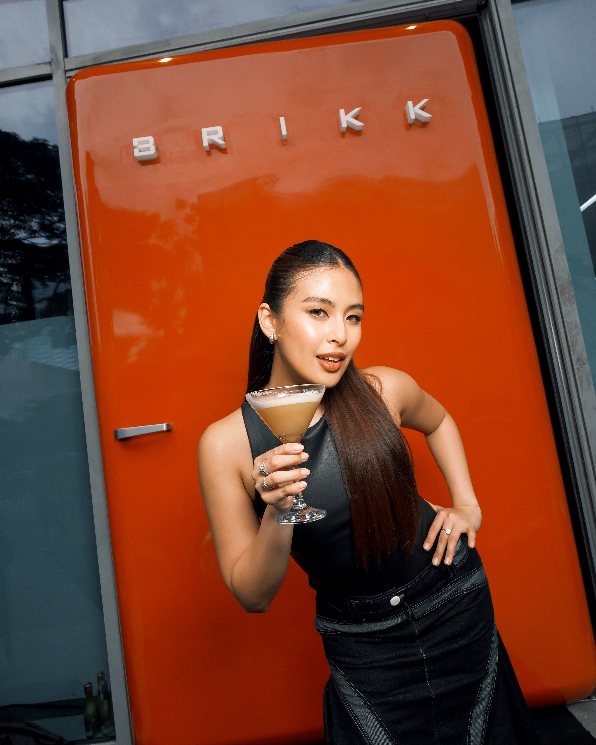
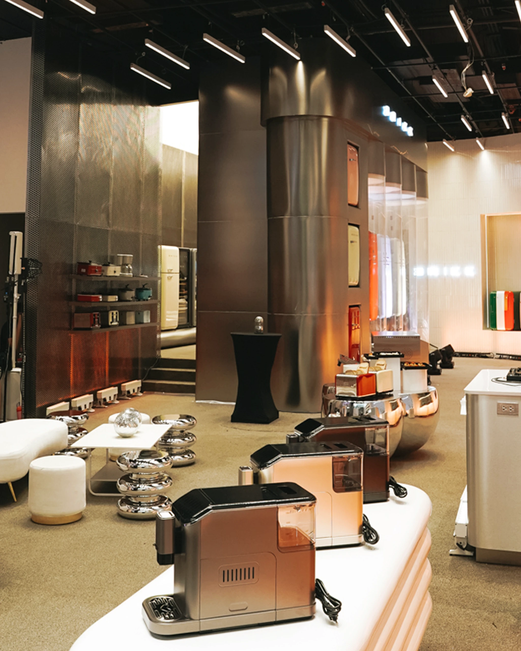
At street level, the W City Center appears like any modern structure in Bonifacio Global City, until a bright red refrigerator interrupts its dark-tinted façade. It’s not an appliance at all, but in fact a door. Its color, scale, and placement function less as a décor and more as a prompt, catching the attention of pedestrians who slow down to make sense of what The Brikk Experience Store is all about.
“That’s how we wanted to start the conversation: unexpected, a little cheeky, and completely Brikk,” says Jaimie Lee, marketing director of Brikk Home Solutions and Appliances. “We didn’t want another appliance store that looks like every other one: rows of white boxes under fluorescent light. We wanted something that makes you stop and say, ‘Oh, this is different.’”
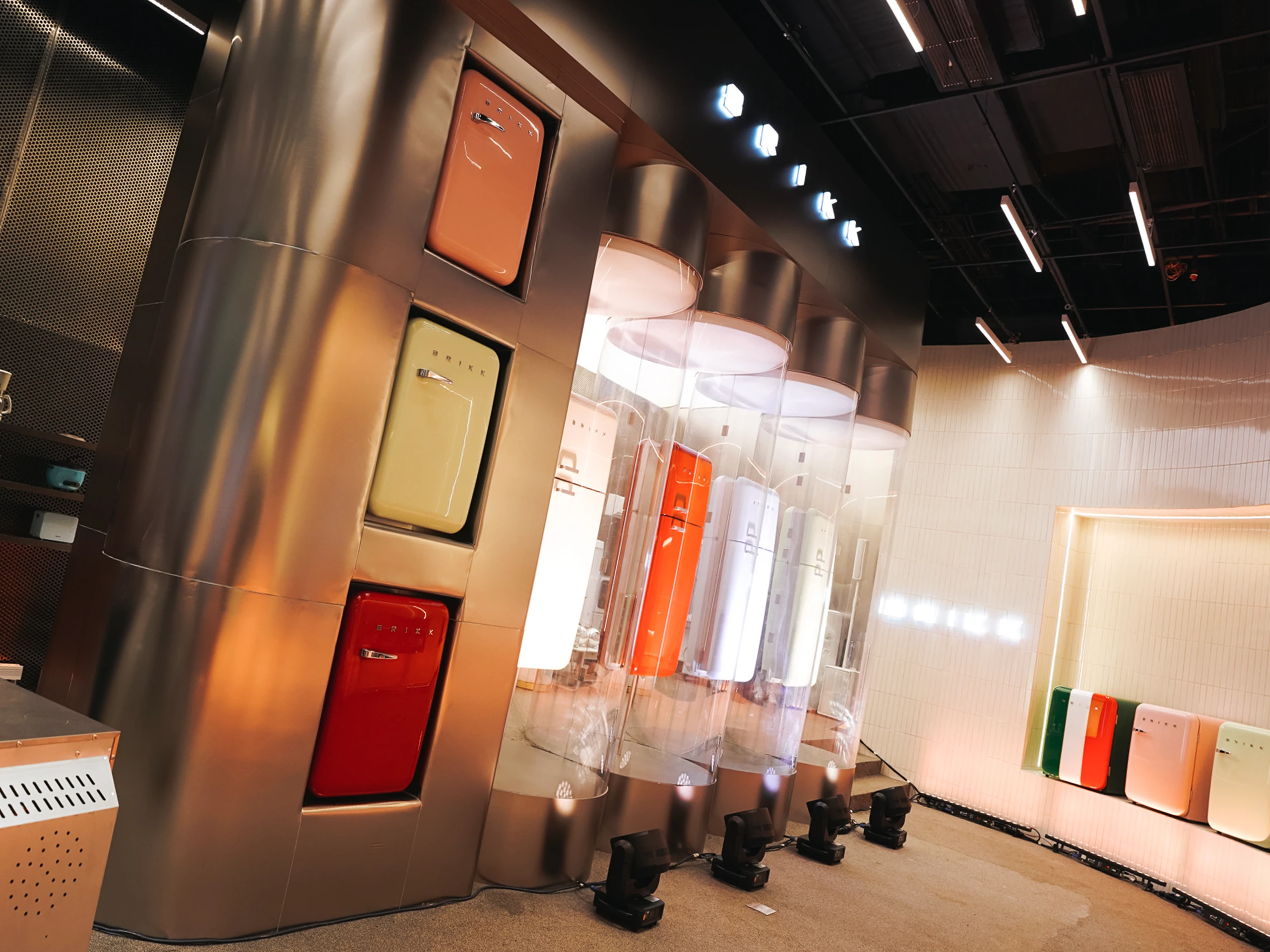
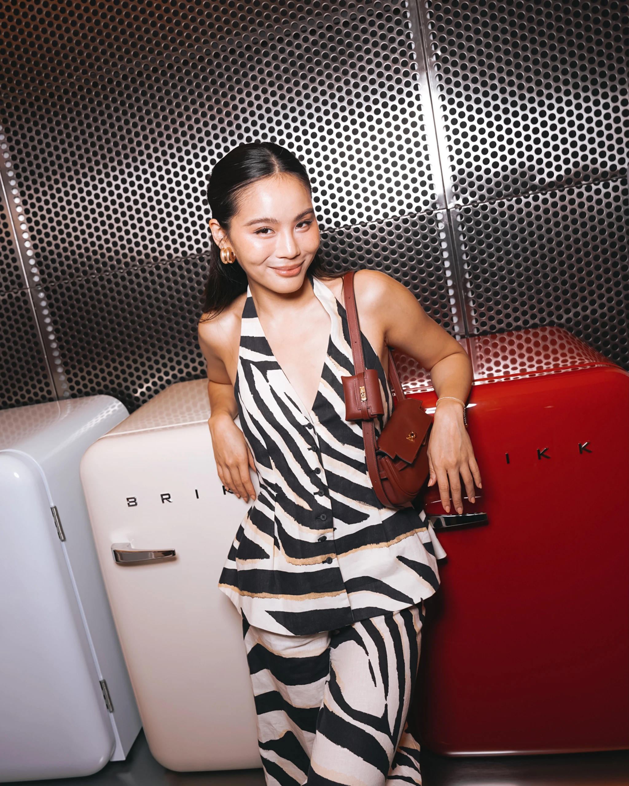
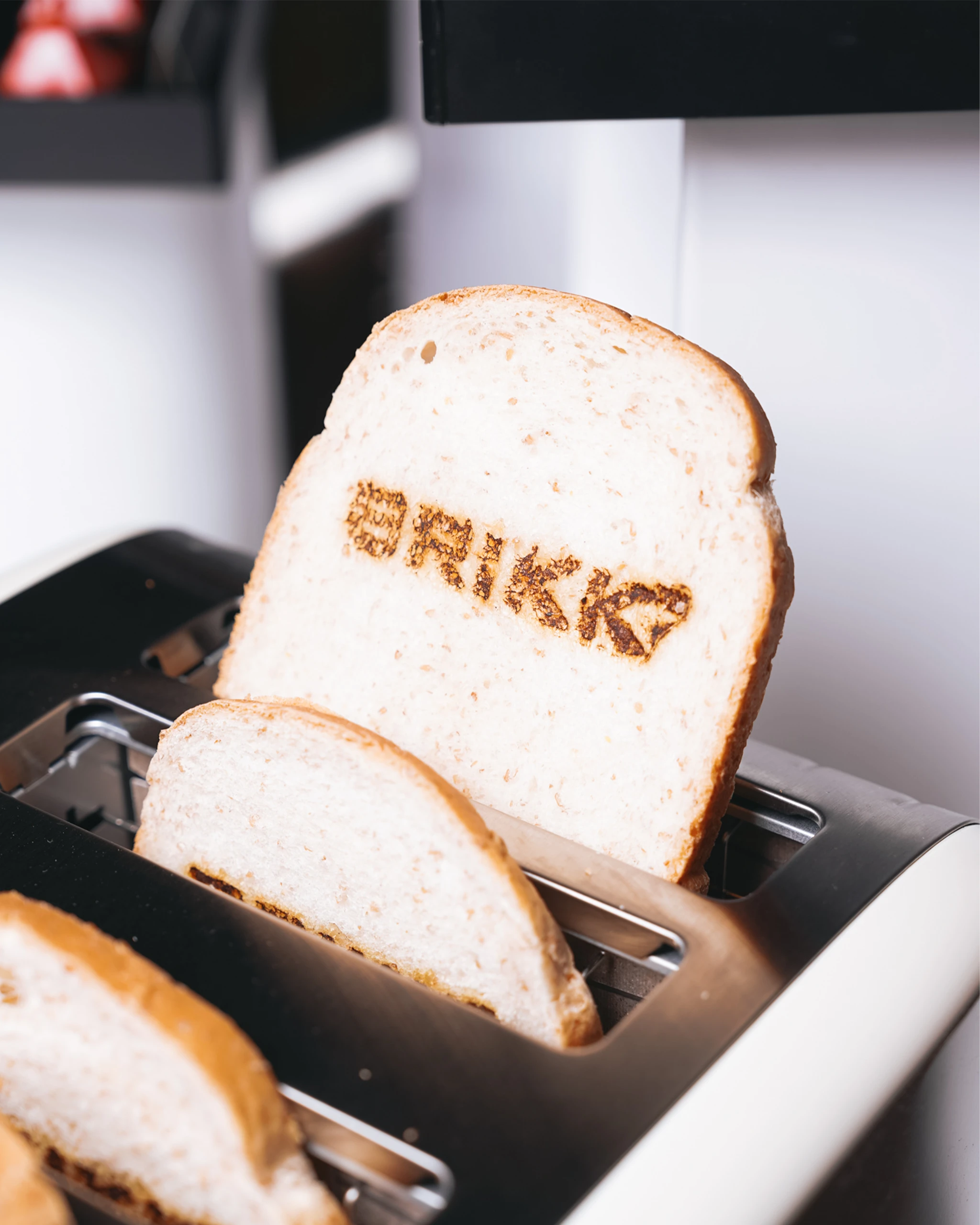
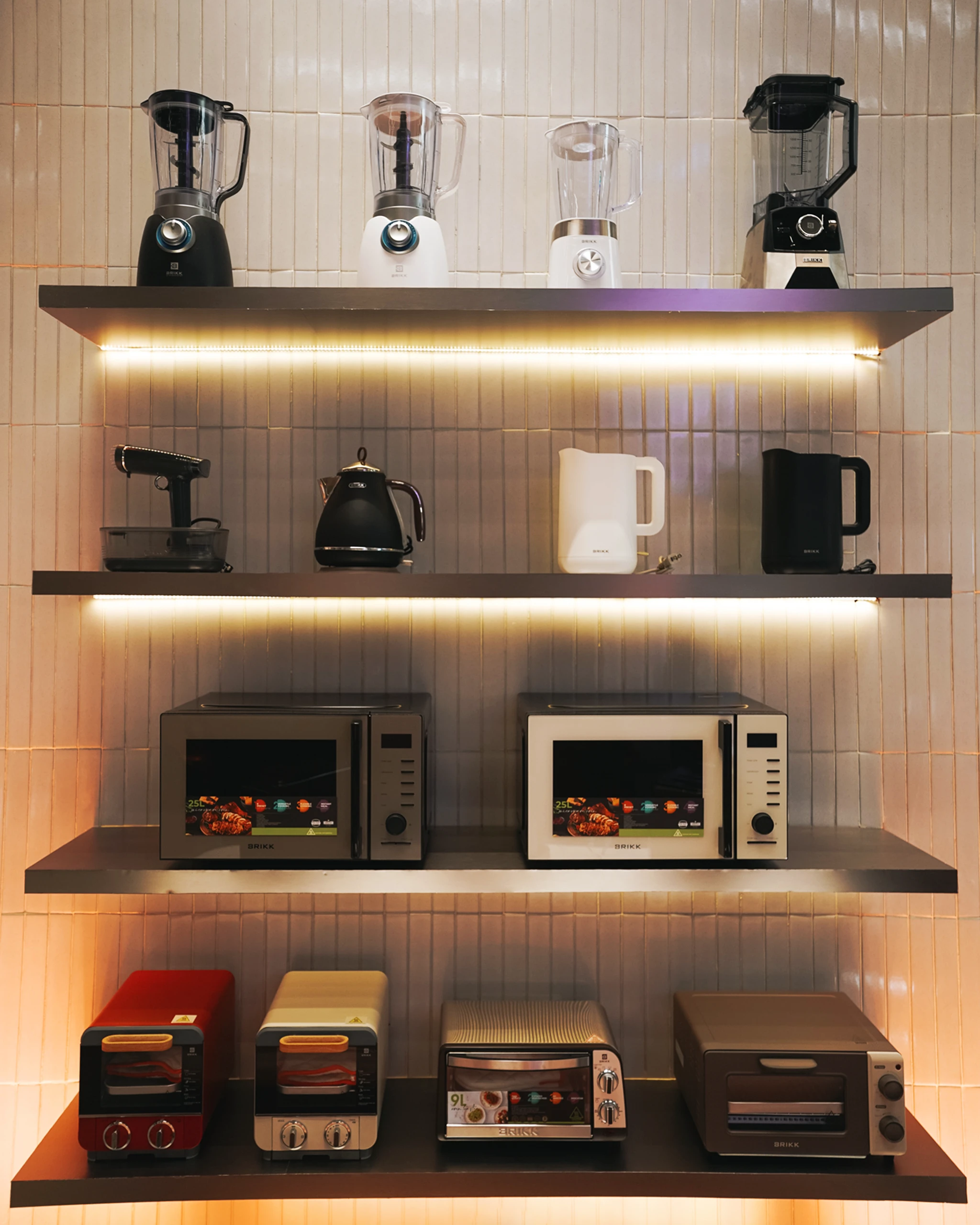
The red refrigerator door sets the tone for what the brand hopes to shift in the local market: the perception that appliances belong quietly in the background. During the launch of the Brikk Experience Store, called The House of Chrome, guests such as Small Laude, Gabbi Garcia, Michelle Dee, Laureen Uy, Sofia Andres, Daniel Miranda, Camille Co, and Jaz Reyes saw the brand’s visual language firsthand: refrigerators displayed in glass pods, blenders, coffee makers, and microwave ovens arranged on shelves against ceramic tiles, and toasters, rice cookers, and fans positioned in front of perforated metallic walls. These pieces lean into color, shape, and personality without sacrificing everyday utility.
According to Lee, this approach is informed by a distinctly Filipino sensibility rooted not in trend, but in lived experience. “Brikk started with a simple truth: Filipinos live beautifully, even when space and time don’t always cooperate,” she shares. “In every home, there’s ingenuity: a rice cooker that never quits, a fan that’s been with the family for years, a TV that holds both laughter and tears.” These observations formed the foundation of the brand’s design philosophy, one that acknowledges the resourcefulness and emotional landscape of Filipino households.
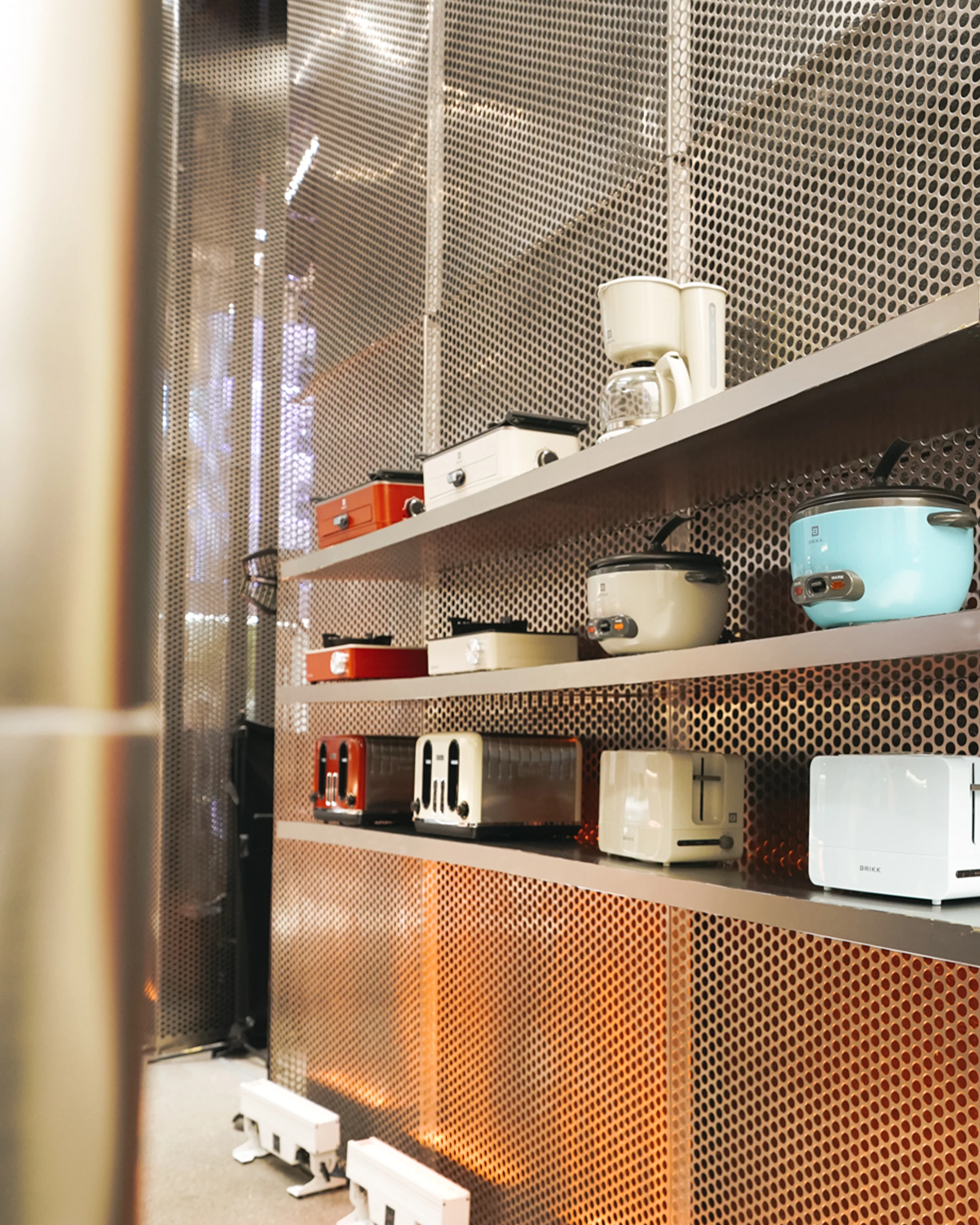
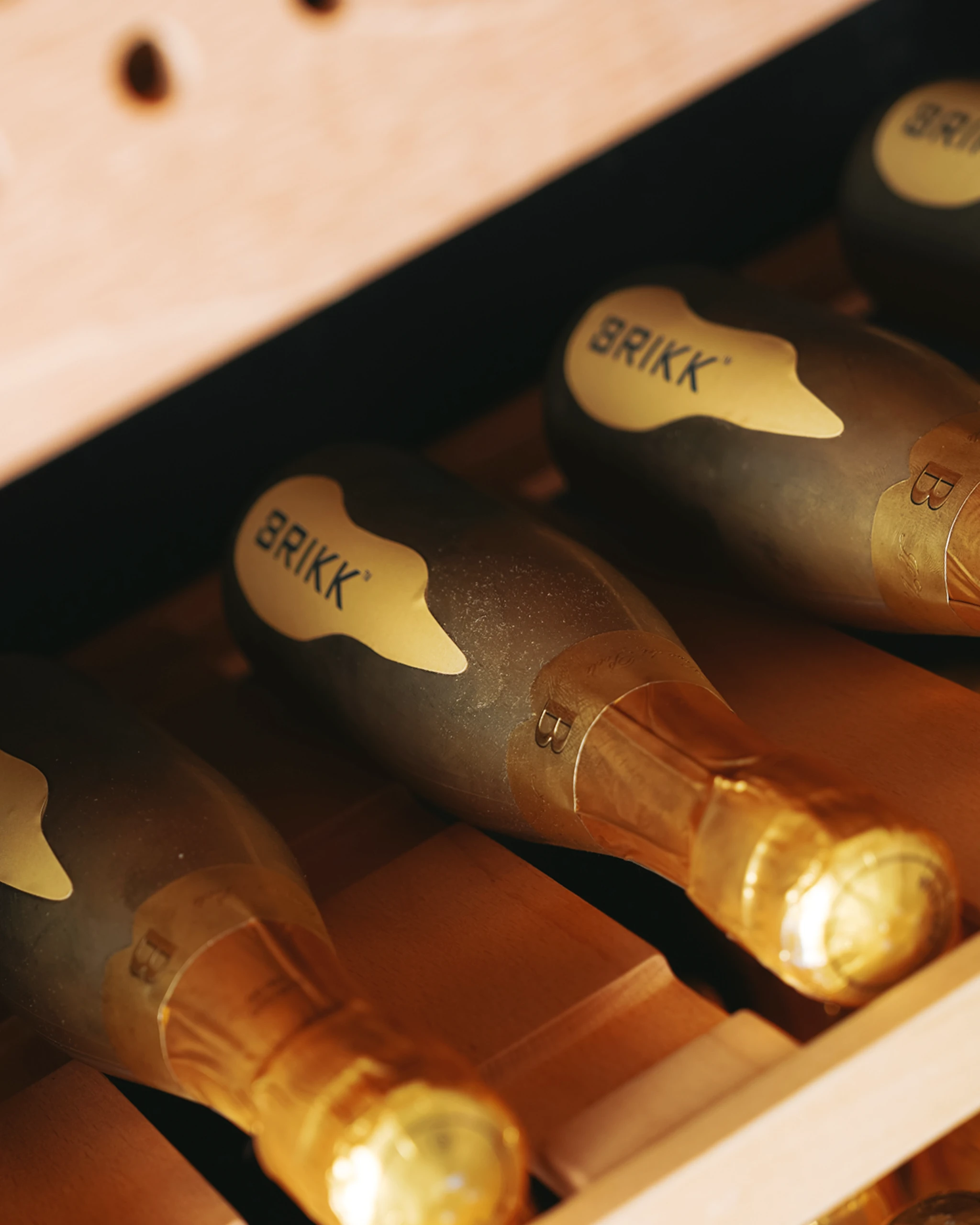
Color plays a central role in this philosophy. Personal blender comes in yellow, sage green, and midnight blue. Pop-up and oven toasters appear in soft pastels; rice cookers in mustard yellow and teal; and their range of retro refrigerators in pink, ice blue, red, and yellow. Even appliances in black, white, or silver feature small but deliberate pops of red and blue on buttons and labels. For the brand, it’s less about being loud and more about reflecting the character of a Filipino home.
“Our appliances are colorful, unapologetically so, because Filipino life is full of color. We design with that same energy in mind: pieces that make you smile, that brighten your counter, that remind you that function can also bring delight,”
Marketing director of Brikk Home Solutions and Appliances Jaimie Lee
Beyond color, Brikk pairs its aesthetic approach with performance. The brand’s product development process centers on durability, reliability, and ease of use. For Lee, this duality in Brikk is essential. “We design from a Filipino point of view, but with a global mindset,” she says, noting that it’s in their ethos to elevate the tools of everyday living without losing sight of the cultural nuances that shape how Filipinos cook, clean, and organize their homes.
Lee punctuates this with Brikk’s purpose: “Our goal isn’t just to represent local design; it’s to move it forward. We don’t want Filipino homes to always be the last to adapt anymore. We want to set the pace.”
For more information, visit Brikk’s official website. Follow them on Instagram.