Does taking a step back to look behind help one leap further forward? So it seems.
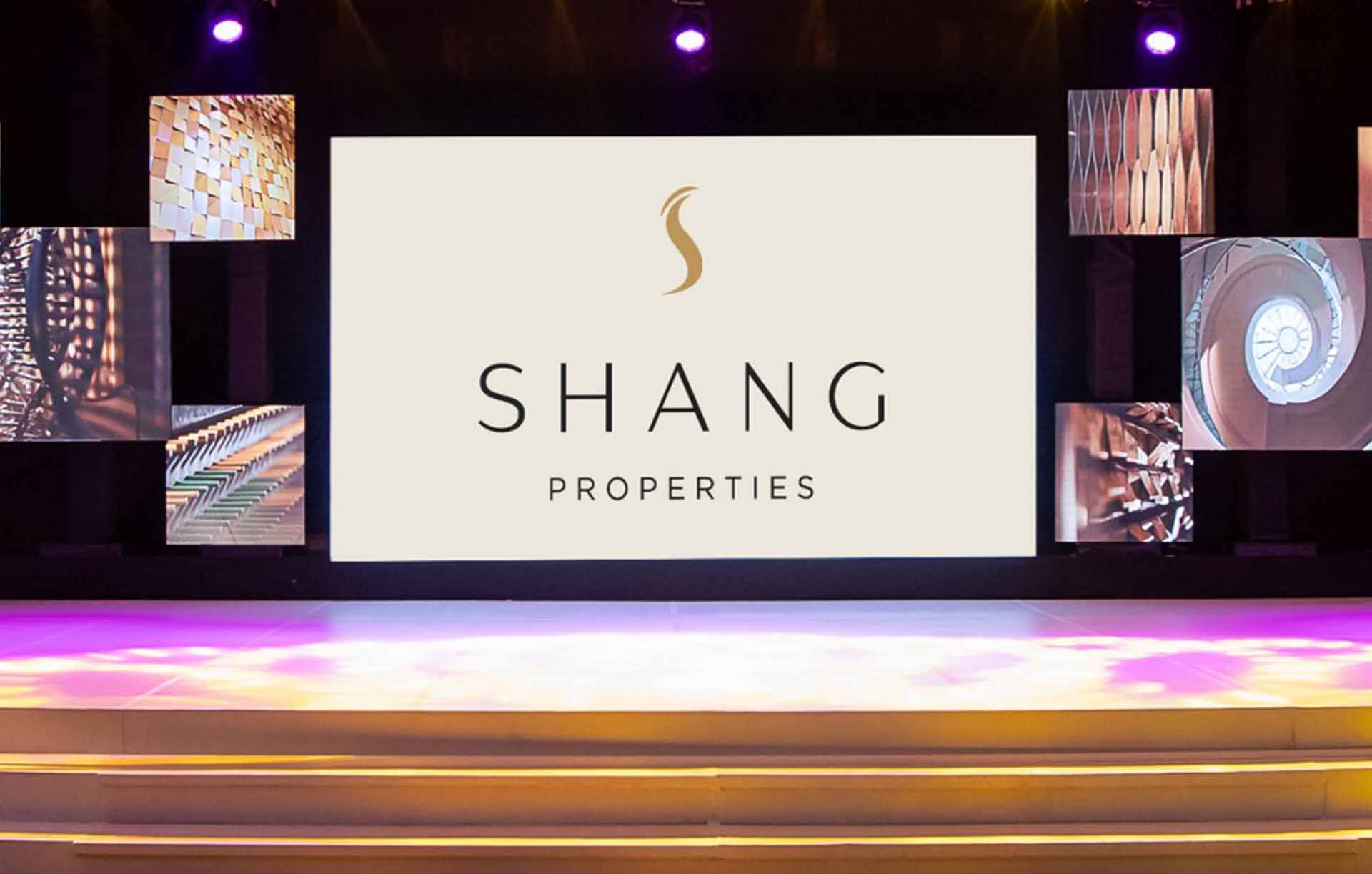
The Crane is a motif that has long been used throughout Shang Properties’ history of over 30 years. It takes shape as the letter ‘S’, with the animal’s long, elegant neck caught in a seemingly choreographed posture, and its crowned head held up high with noble grace.
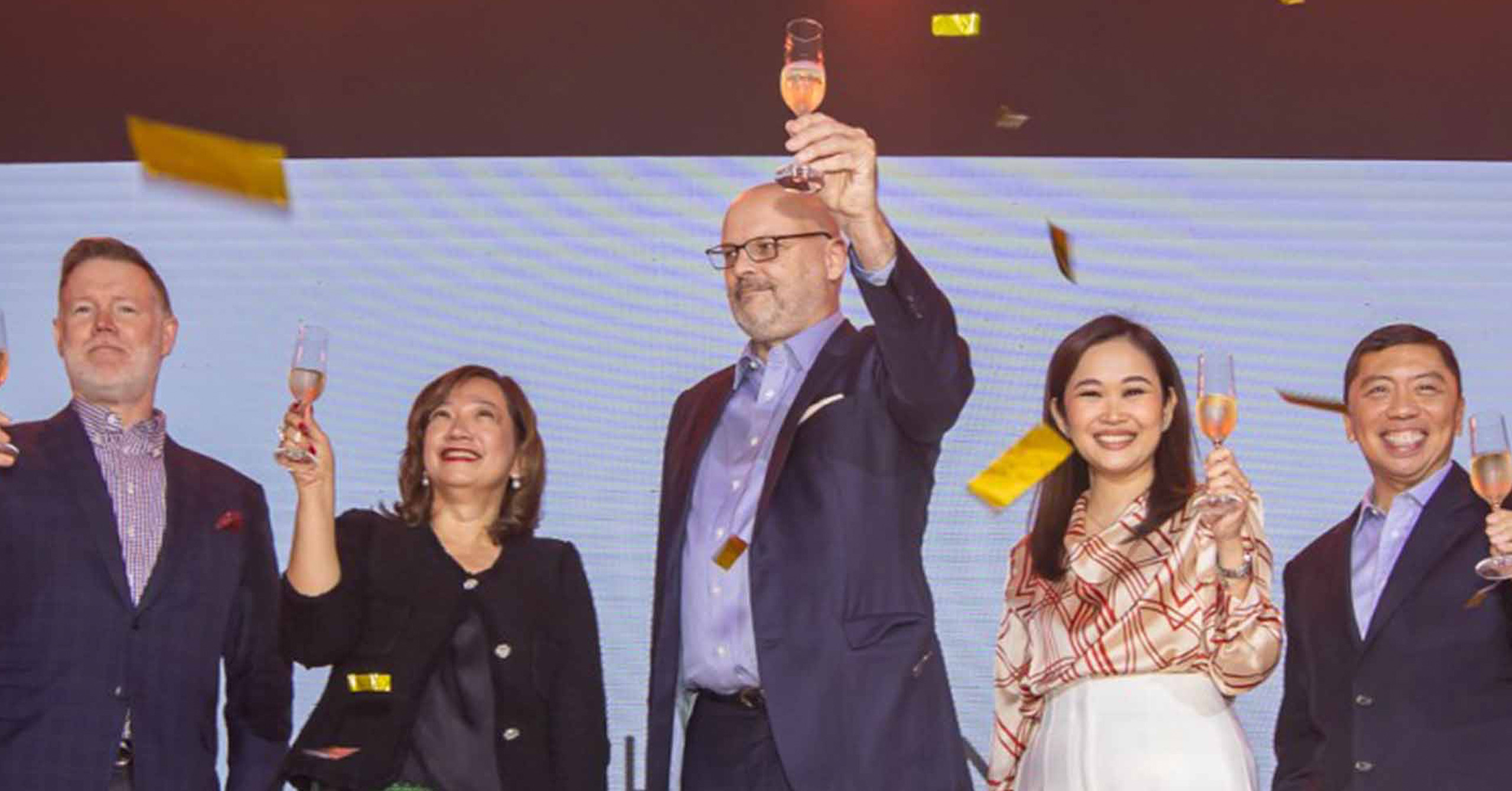
To usher in a new era of luxury living, the property investment developer revealed at the Shangri-La The Fort, Manila a modern identity that was informed by such heritage. This brand new identity, along with the latest iteration of The Crane logo, was unveiled in an afternoon soirée with the theme ‘Filipino in Details’ and through a brand film entitled ‘Closer’.

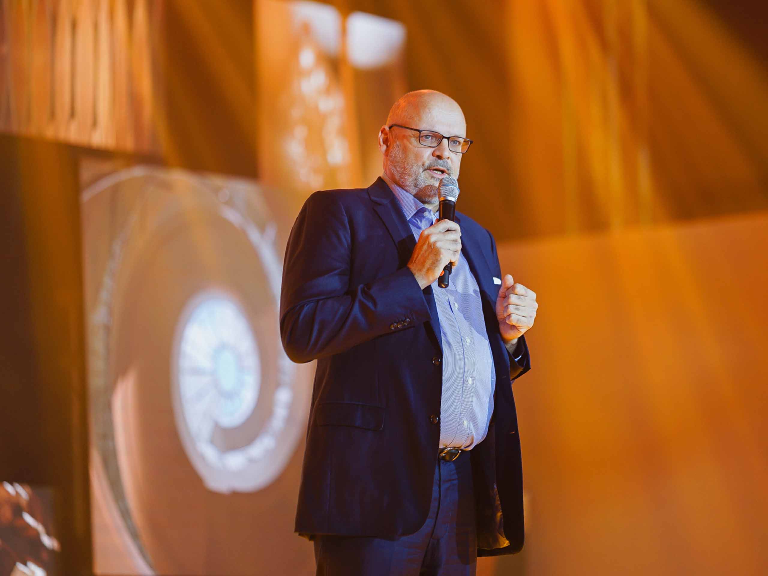
“Our brand refresh is a reflection of the changing world,” said Wolfgang Krueger, Shang Properties’ executive director. “Times have changed and consumers have different needs and desires. We recognized that we need to innovate and adapt to our market’s tastes. But what remains is our commitment to boldly moving forward, staying true to our promise of excellence, and setting higher standards in luxury living. In this new era of sophistication, we are not just changing with the times. We are leading the change.”
An homage to its predecessor, The Crane now features a more streamlined look, however, retains the familiar elements and colors that have strong ties to Shang Properties and its DNA. Such is an effort to show the brand’s lasting commitment to creating inspired spaces that are thoughtful and meticulously designed with unity and coherence in mind.
Additionally, the text has also been updated, from serif to sans serif, to reflect a subtle tone of modernity. Overall, the refreshed look banners the brand’s affinity for details, whether big or small, as well as its design philosophy of uncompromising vision, elegance, and harmony.

“Our refreshed logo and branding marks the beginning of a new era of sophistication. The luxury real estate market continues to change and evolve and we strive to be at the forefront of change. We want to redefine luxury and set new standards. Our journey is just beginning and we are honored to continue creating Exemplary Life Spaces,” Krueger stated.
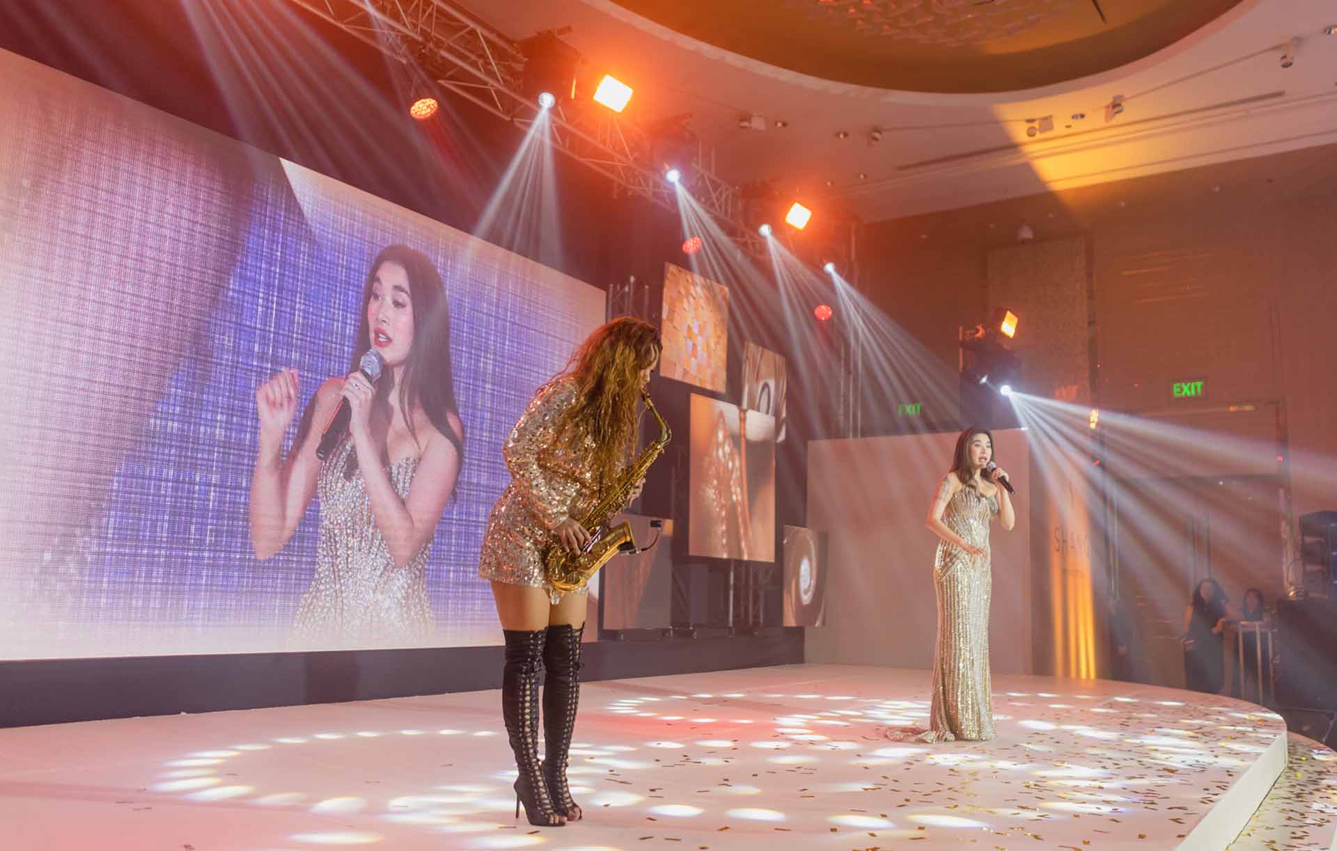
Much to the guests’ delight, the afternoon at Shangri-La The Fort was brimming with finesse and the exquisite taste that Shang Properties is known for. Patrons had the chance to walk through a gallery exhibiting residences and commercial spaces designed by Shang Properties, allowing complete immersion into its history and award-winning developments over the span of 36 years. They were also serenaded by Nicole Laurel Asensio, a renowned Filipino singer, songwriter, and actress.

The program also put the spotlight on its recently launched developments, including the Laya by Shang Properties in Pasig City, Shang Residences at Wack Wack, and the Aurelia Residences and Haraya Residences under Shang Robinsons Properties, Inc., a joint venture between Shang Properties and Robinsons Land Corporation. Additionally, the developer teased guests on two upcoming projects in Cebu and Quezon City, which are said to become the next coveted addresses.
For more information, visit the Shang Properties website and follow Shang Properties on Instagram and Facebook, YouTube, and LinkedIn.
