Inside a 1960s Paris Apartment That Redefines French Flair
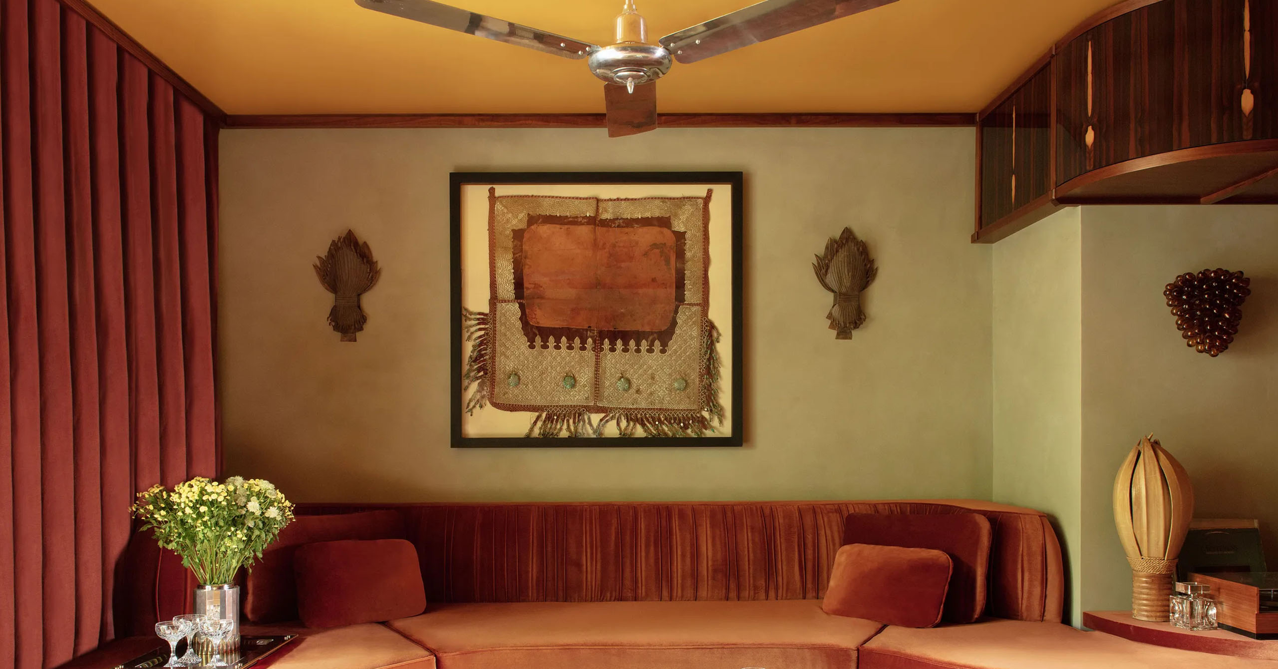
Hugo Toro designed the living room’s curving sofa, which wears a Pierre Frey velvet. Vintage copper sconces flank a framed Moroccan horse saddle. 1970s cocktail table; custom carpet by Édition 1.6.9.
Hugo Toro designed the living room’s curving sofa, which wears a Pierre Frey velvet. Vintage copper sconces flank a framed Moroccan horse saddle. 1970s cocktail table; custom carpet by Édition 1.6.9.
A rejection of Haussmann style, in-demand young designer Hugo Toro wanted something “more cinematic” for his personal abode
When Hugo Toro first saw his new apartment in eastern Paris, close to the Parc des Buttes-Chaumont, he immediately realized its potential. He had been looking at buildings from the 1960s and ’70s, and he was drawn to the floral pattern on the floor in the entrance of this unit. As soon as he saw it, Toro decided to turn it into a motif for his personal project: “I used a geometric version of the checkerboard in the hall, choosing red and white travertine to retain the building’s period feel, and then I repeated the pattern throughout the apartment.”
As with other apartments he has designed, this one was conceived as a warm, welcoming hotel suite. “For me, there’s nothing better than a hotel room where you feel good,” Toro says. He began his redesign by tearing down everything and then starting anew, reorganizing the space to create a more open, light-filled loft. “I didn’t want a Haussmann-style flat with moldings, I wanted a more cinematic feel,” he explains. “It’s a space that’s not rooted in the Parisian vernacular, but which touches me more directly. It allows me to disconnect from my other projects when I get home in the evening.”
At the heart of the project is a powerful palette of rich hues and calculatedly dramatic contrasts. Since his early childhood, Toro has been fascinated by the play of colors and textures, influenced by his Mexican mother who admired the painter Diego Rivera. “There’s a pictorial side to this apartment,” he notes. “I love Luis Barragán and his Casa Pedregal in Mexico City—the green color of the pool, the pink walls. It’s one of the houses that has made the strongest impression on me. Even though I’ve never lived in Mexico, its textures and colors fill the sketches in the pages of my notebooks.” Indeed, influences from around the world can be seen in all of his design work, and other touchstones include the buildings of Otto Wagner and Adolf Loos in Vienna and John Lautner in Los Angeles— two cities where he did his graduate work.
After school, he launched his own studio in 2020. Since then, the now 34-year-old designer has been taking on a rapidly growing number of big projects. His latest ones include Booking Office 1869, a bar-restaurant in London’s St. Pancras station, which took a Victorian winter garden as its inspiration; the remodel of the studio atop the historic Payne Whitney Mansion, Villa Albertine’s New York City headquarters; and Orient Express’s La Minerva Hotel, in the former Palazzo Fonseca in Rome, due to open at the end of 2024. Toro’s approach is to imagine an entire world with its own strong narrative. His architectural work has a scenographic quality, with every project conceived as a set, complete with carefully staged spaces and an extreme attention to detail.
In this apartment, in addition to the geometric floor, another element helped shape the space: the yellow lacquer on the ceiling. Toro chose the color because the walls were initially covered with a yellow moiré fabric, and it complemented the watery green tone of the bath’s original wallpaper. Those walls have since been refinished in a custom limewash, Toro notes, adding, “I like to engage with traces of the past, as a way of preserving the soul of a place.” He continues, “Both lacquer and bold color are less common in apartments, but I use them regularly in my hotel and restaurant projects. Clients don’t come to me looking for beige and gray.”
While admitting that it’s important to find the right balance, “I don’t think you get tired of colors,” he asserts. “But I’d rather get tired of a color than not take any risks.” With the apartment’s nine-foot-high ceilings, the lacquer also helped to instill a sense of verticality to the space, while its play of reflections provides indirect light. In this apartment, wood is also used to striking effect, with three different species—walnut, sweet gum, and ziricote—employed to provide contrast.
Toro also designed much of the furniture himself, punctuating the space with travertine pieces from his new Amanecer collection, created with Kolkhoze gallery and M Éditions. In the bedroom, the angled niche above the bed adds a surprising element. “I wanted to achieve a hotel feel, but at the same time follow a more Brutalist approach,” he notes. “Here, it’s almost like a temple or Batman’s lair in his villa…only more exotic.” He also worked extensively with curves to counterbalance the rectilinear aspect of the apartment, smoothing the transitions between spaces as well as materials and volumes. “I like accidents,” he confesses. “I’m neither a maximalist nor a minimalist; I like living architecture.”
Translated from French by John Newton.
Hugo Toro’s home appears in AD’s November issue.
-
1/12
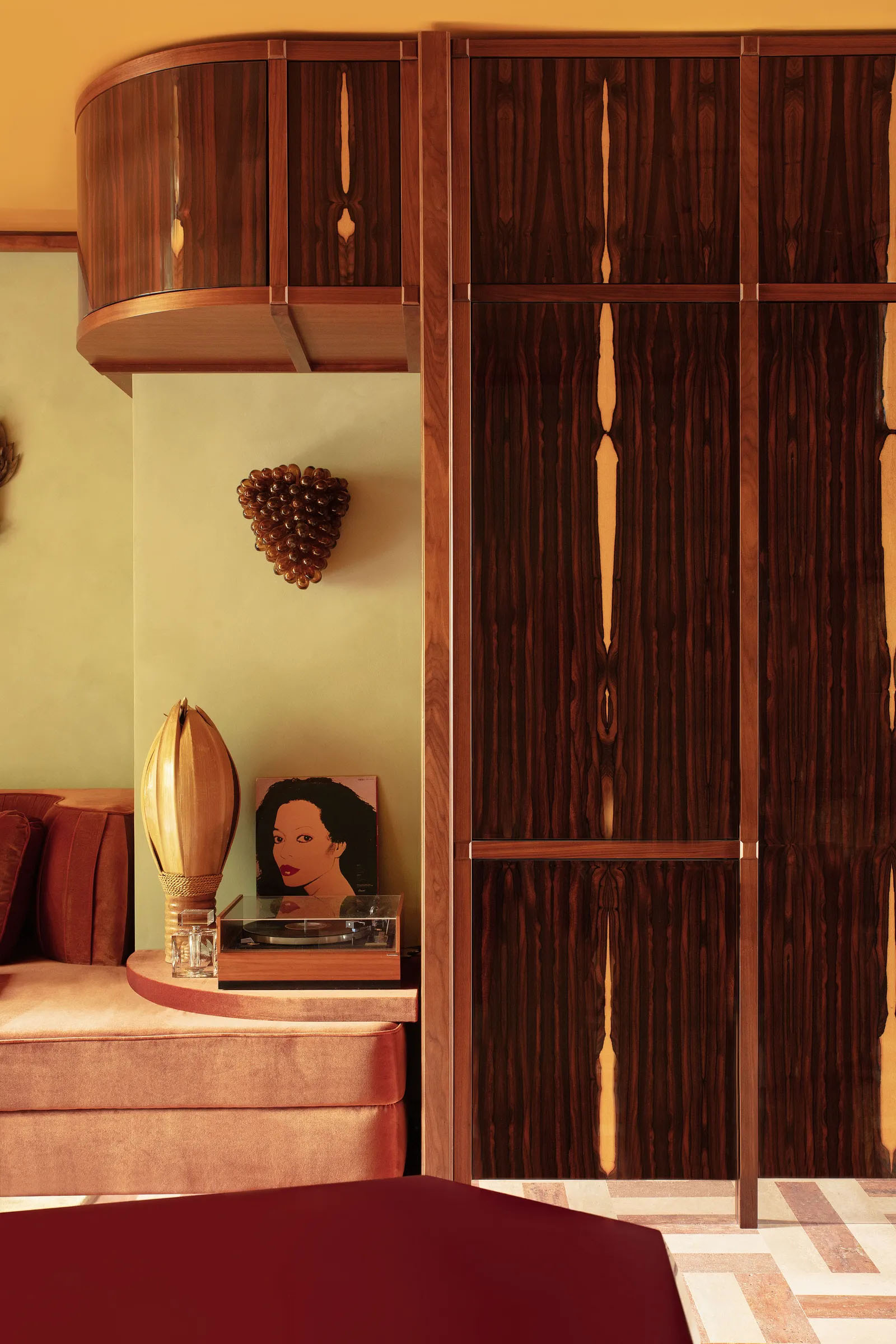
In the living room, a Murano glass sconce hangs above a vintage coconut lamp, turntable, and the Andy Warhol–designed cover of Diana Ross’s 1982 album, Silk Electric, on a shelf next to bespoke lacquered ziricote cabinetry.
-
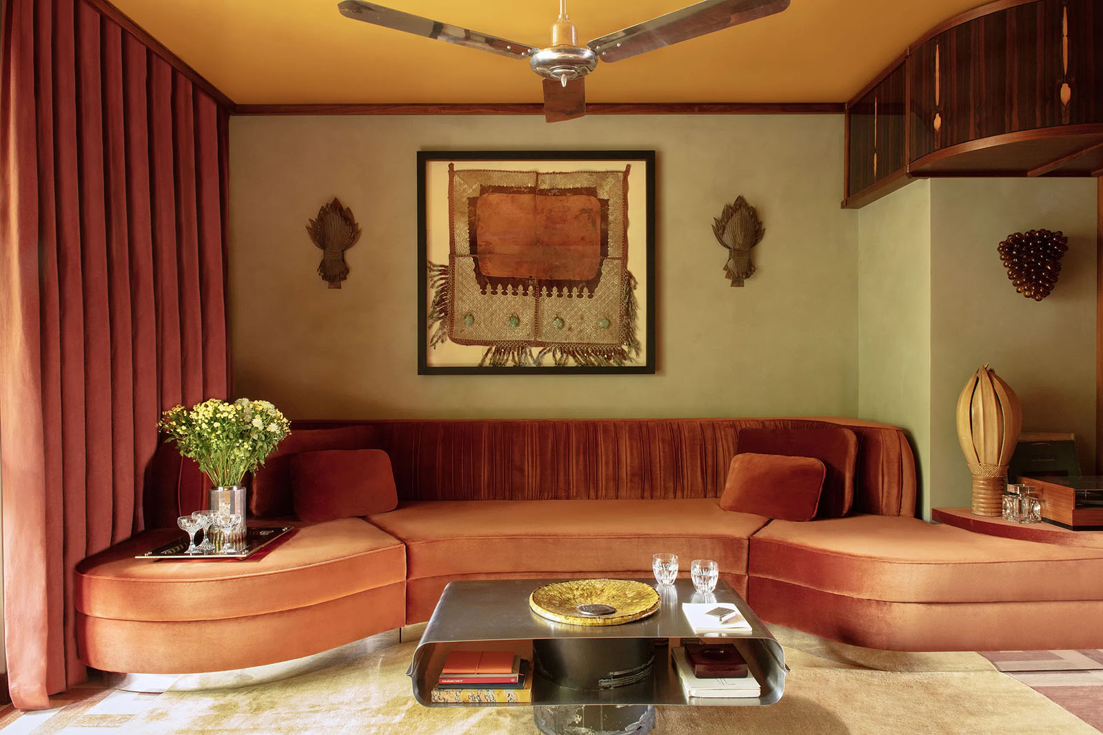 Hugo Toro designed the living room’s curving sofa, which wears a Pierre Frey velvet. Vintage copper sconces flank a framed Moroccan horse saddle. 1970s cocktail table; custom carpet by Édition 1.6.9.2/12
Hugo Toro designed the living room’s curving sofa, which wears a Pierre Frey velvet. Vintage copper sconces flank a framed Moroccan horse saddle. 1970s cocktail table; custom carpet by Édition 1.6.9.
-
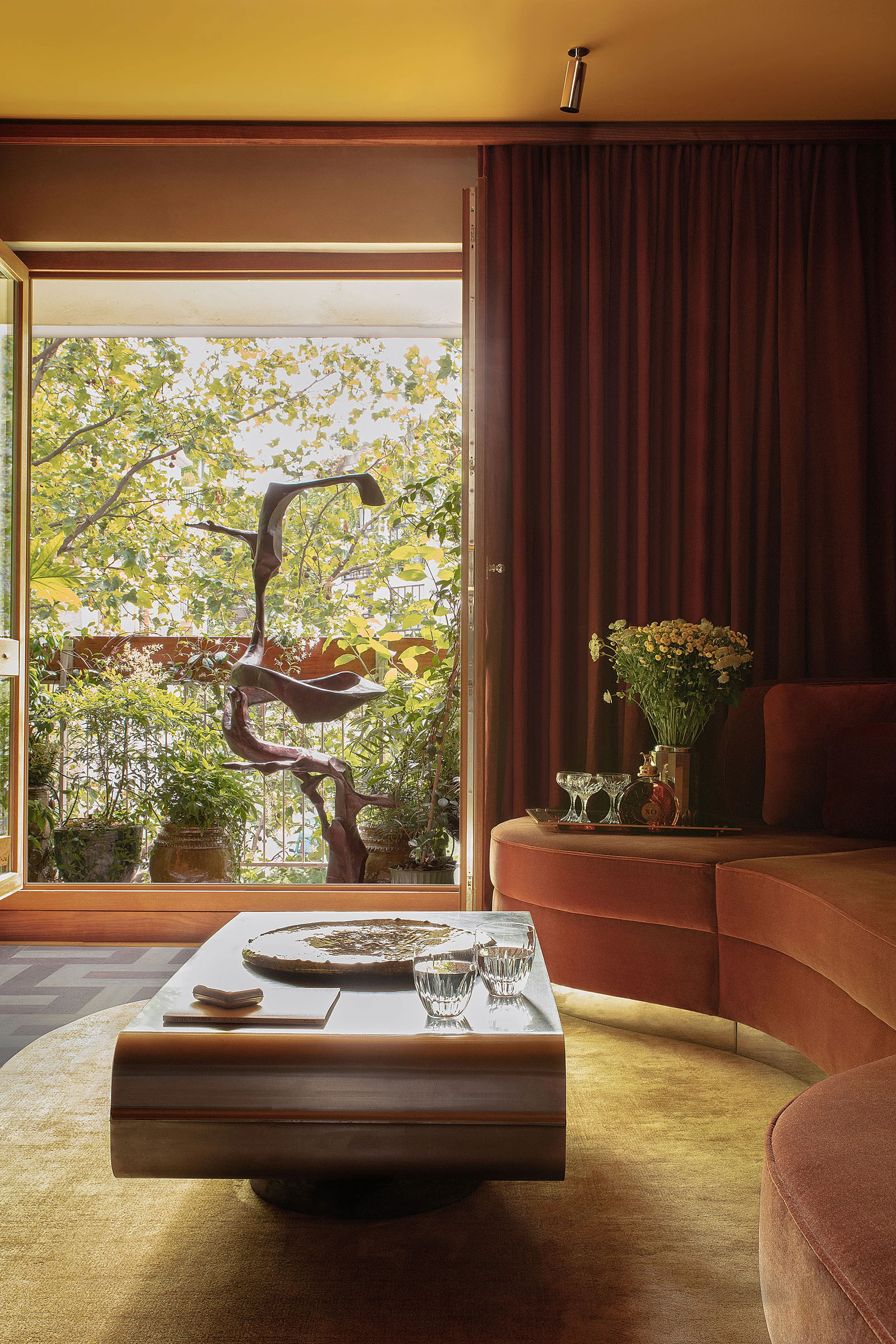 3/12
3/12A 1968 iron sculpture by Sido and François Thevenin from Galerie Patrick Fourtin stands on the terrace outside the living room. A champagne bucket serves as a vase, and the glassware is by Baccarat.
-
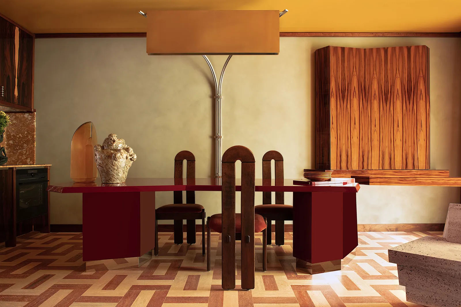
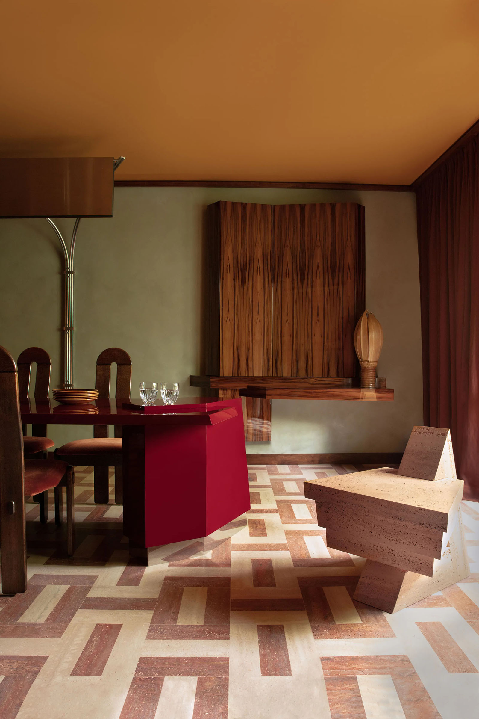
4/12
The dining room’s red lacquer table and overhanging lamp were designed by Toro. 1970s chairs; Jules-Aimé Grosjean vase from Galerie Vauclair. The lacquered sweet gum console at right hides the television. Red and white travertine covers the floor here and throughout the apartment.
-
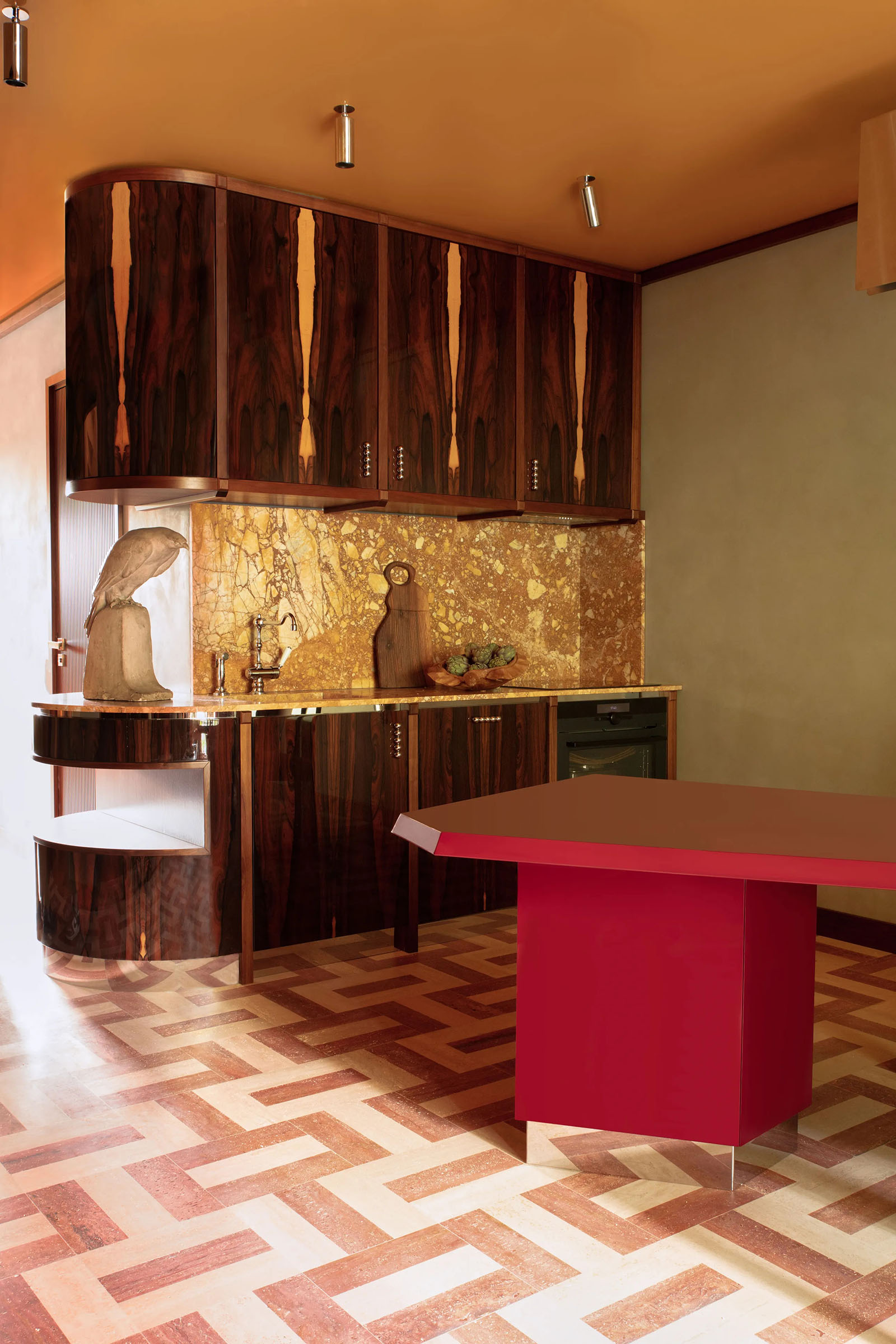 5/12
5/12Looking into the kitchen from the dining area. The space’s contrasting materials include lacquered ziricote cabinetry, Breccia Siena marble on the walls and countertop, travertine flooring, and the brightly lacquered table and ceiling.
-
 6/12
6/12Another view of the dining area. The chair at front right is the Female Chair from Toro’s Amanecer collection for Kolkhoze Gallery and M Éditions.
-
7/12
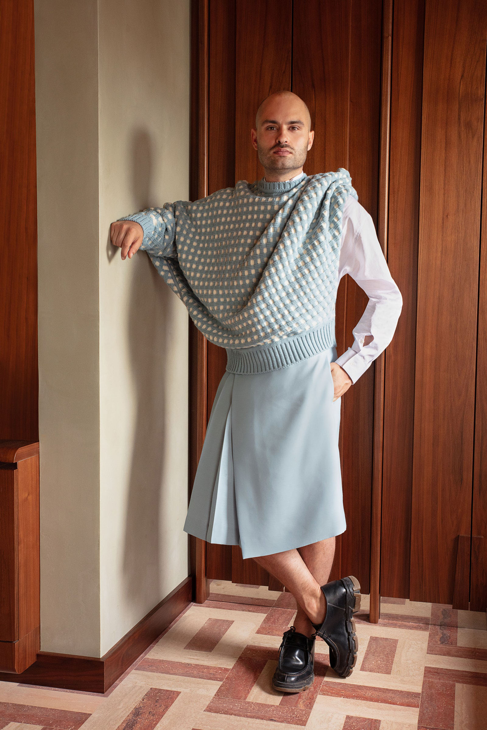
Toro in a sweater, shirt, and kilt by Dior Men.
-
 8/12
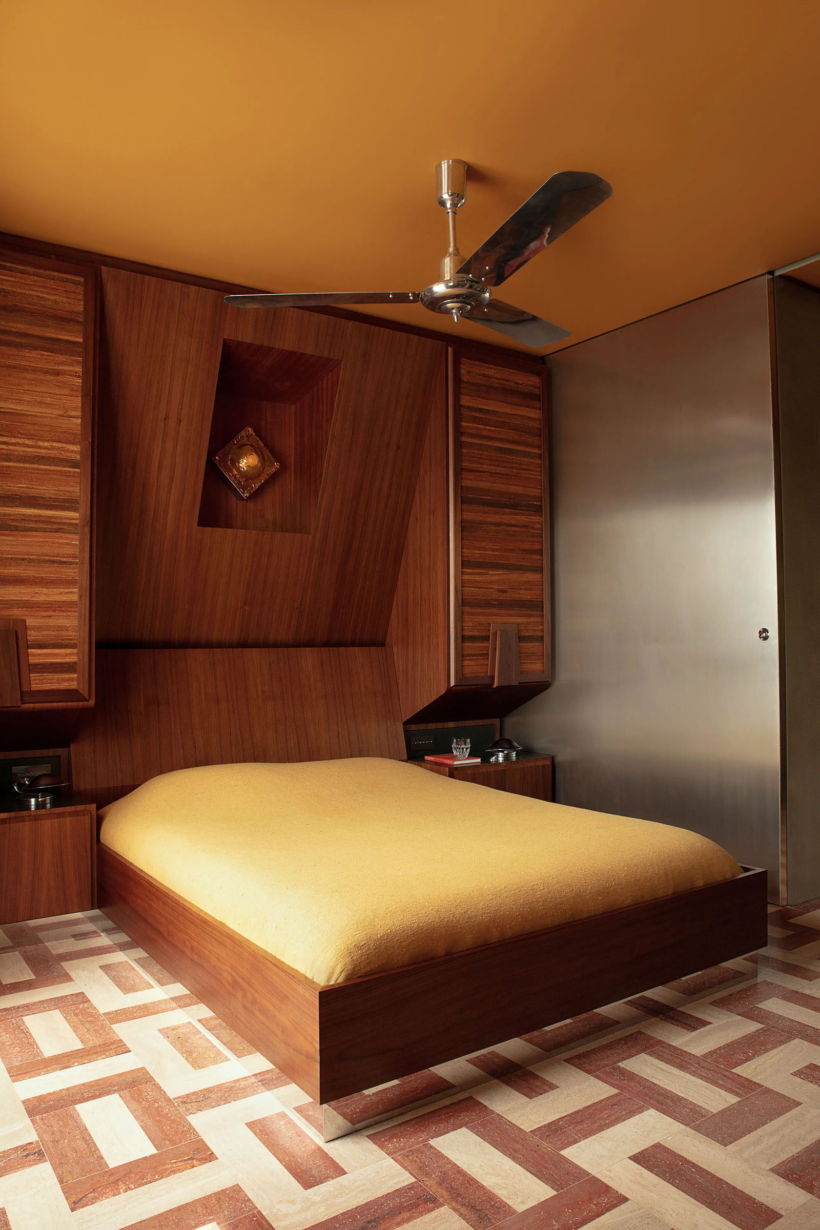
8/12For the bedroom, Toro designed a wall-spanning unit incorporating the bed, headboard, nightstands, and storage cupboards. Chrome ceiling fan; Murano lamp (in niche above bed); 1930s chrome lamps by Josef Hůrka for Napako; bedspread by Maison de Vacances.
-
 9/12
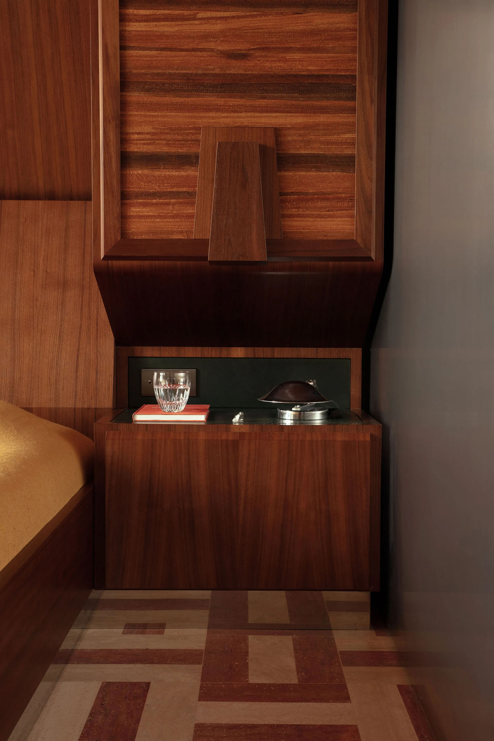
9/12A view of the bed’s built-in nightstand.
-
 10/12
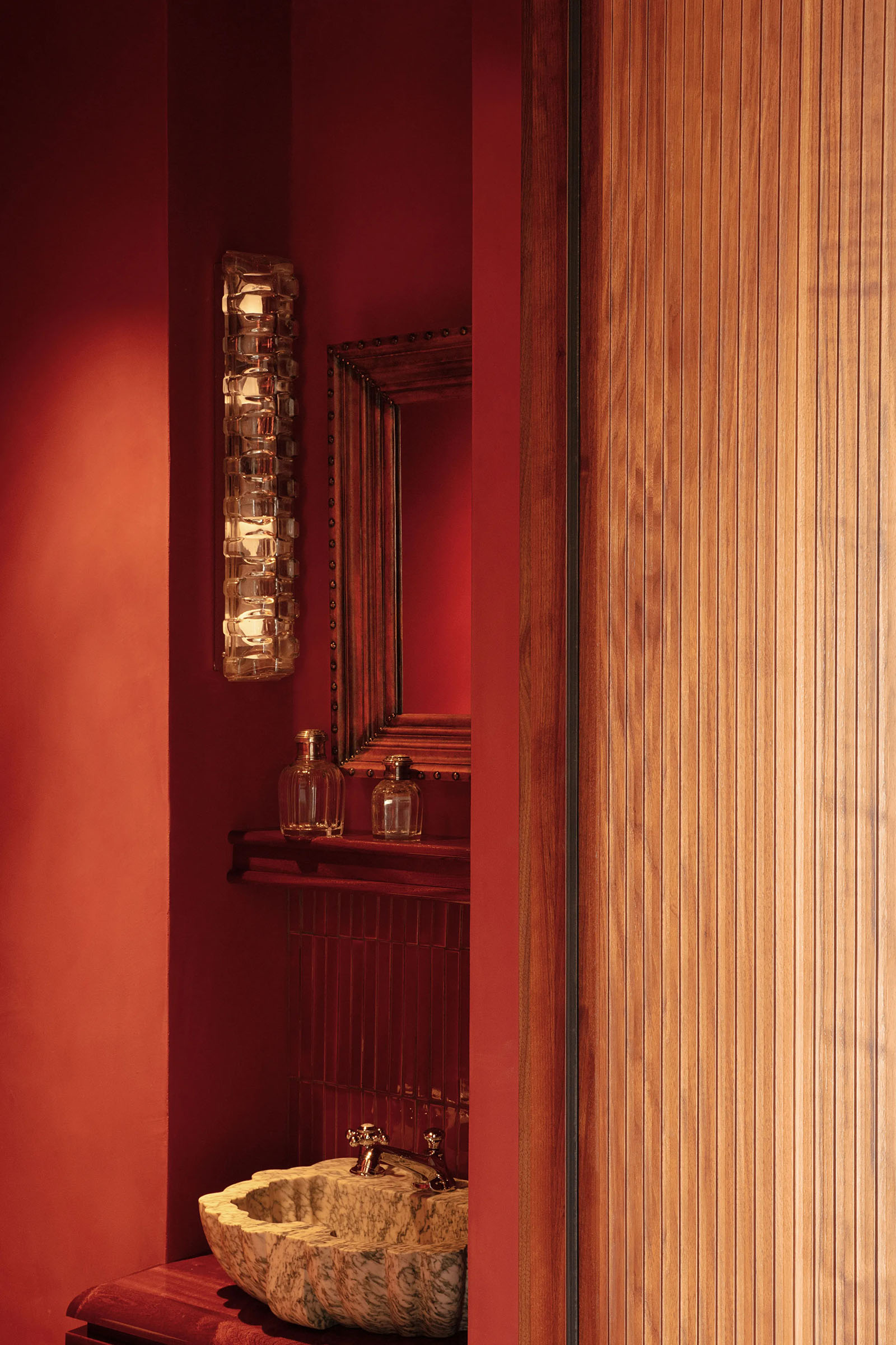
10/12A vintage lamp and brutalist mirror sourced at a flea market hang above a custom Toro-designed sink.
-
 11/12
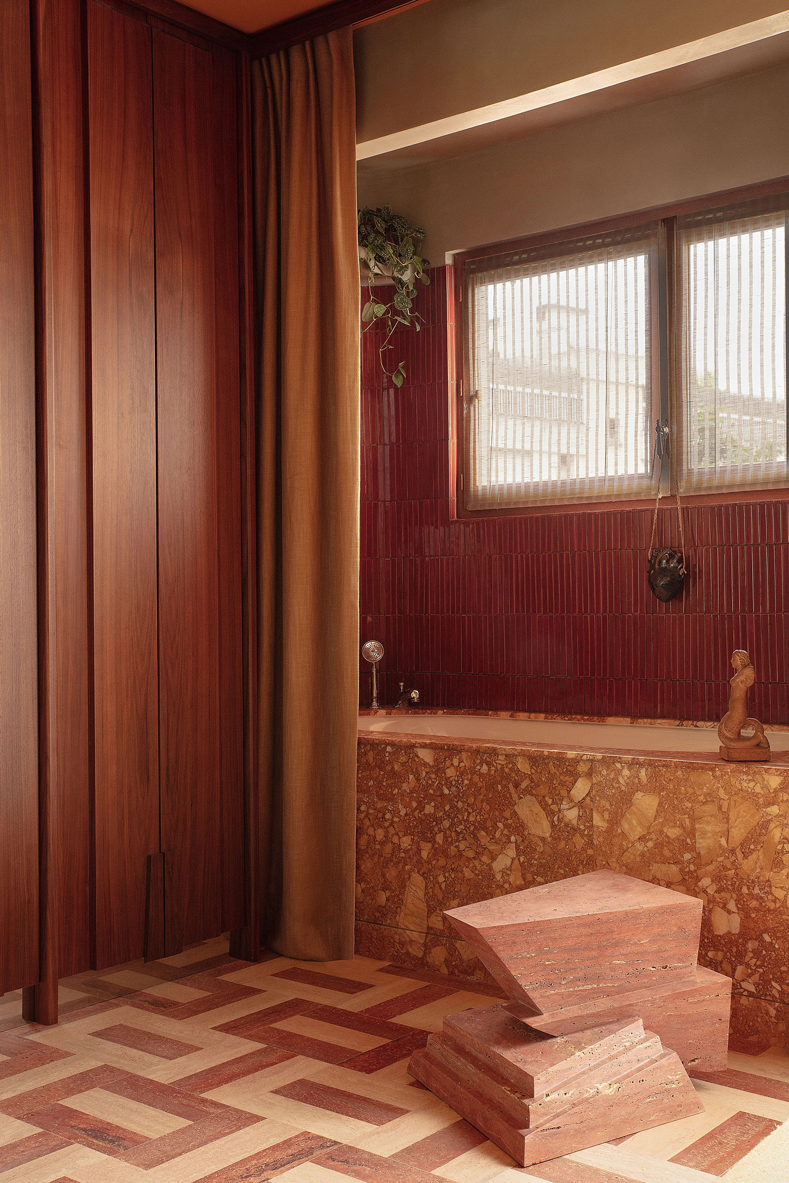
11/12In the bath, Breccia Siena marble clads the tub, and the niche is covered in fluted tile by Céramiques du Beaujolais. Travertine side table from Toro’s Amanecer collection for Kolkhoze Gallery and M Éditions; mermaid sculpture by Henry Parayre from Galerie Patrick Fourtin.
-
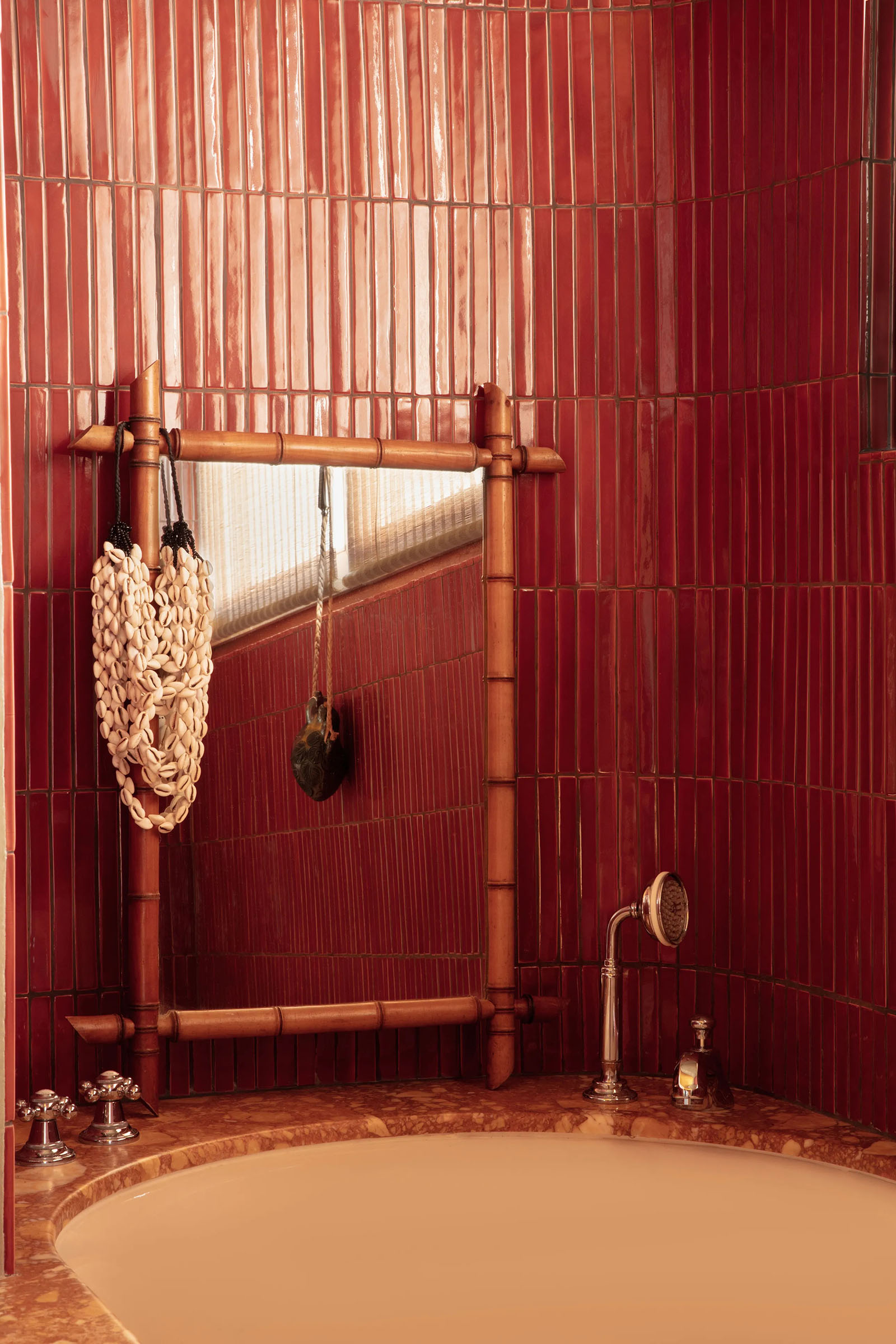 12/12
12/12A shell necklace hangs on a vintage bamboo-framed mirror in the bathtub niche. Tub filler by THG Paris.
This was originally published on Architectural Digest.