Gabrielle Uy Reveals the Creative Magic Behind Laufey’s Most Coveted Merch


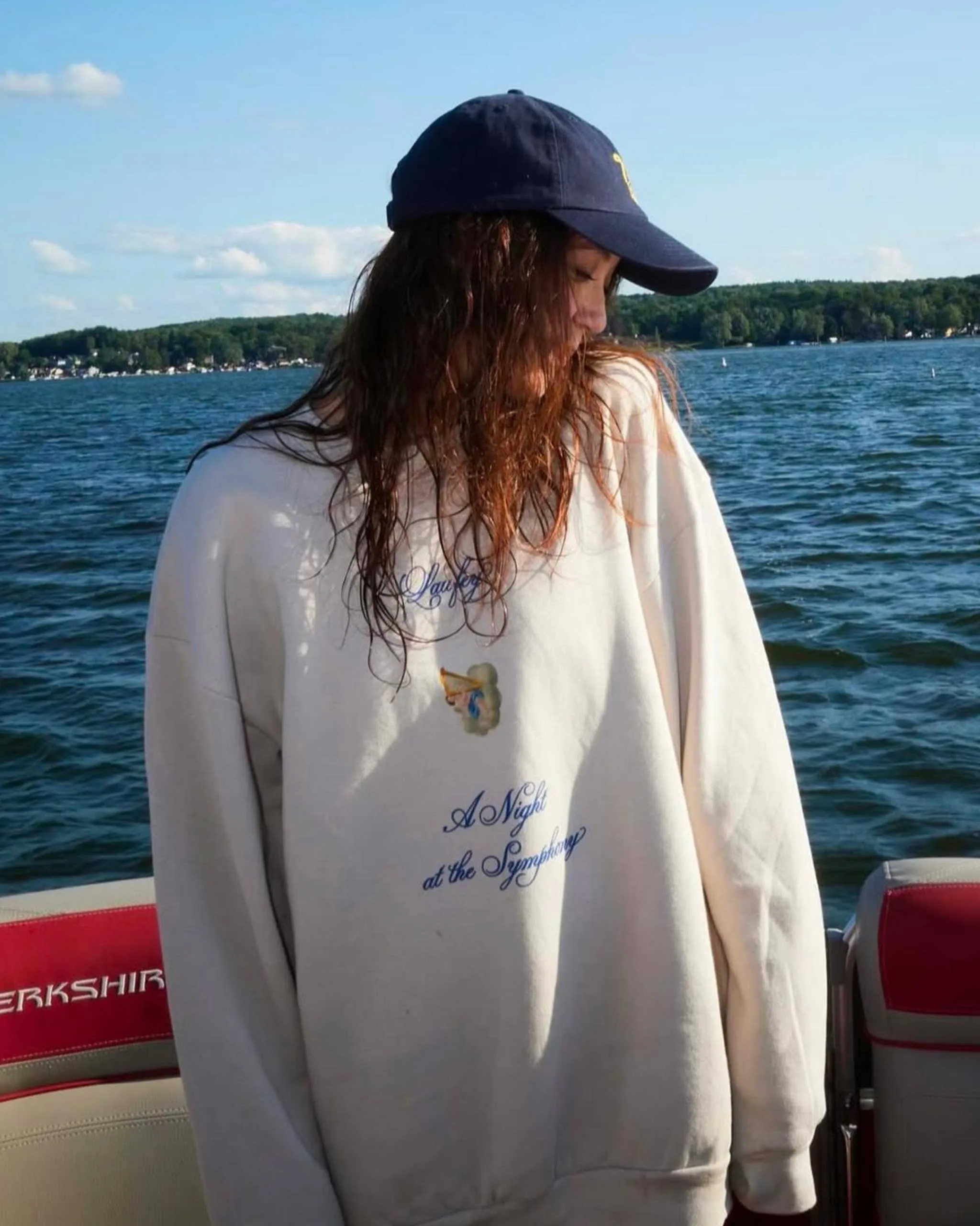
Photographed by Elizabeth Miranda. Courtesy of Laufey US
Gabrielle Uy speaks about collaborating with Laufey, navigating New York’s creative scene, and why nostalgia and human connection remain central to her work.
In today’s music economy, merchandise has evolved far beyond the humble tour T-shirt. It’s a serious business in its own right; think Justin Bieber’s sold-out SKYLRK collection, Taylor Swift’s cardigans, Drake’s “personal essence” candles, and Lana Del Rey’s viral heart-shaped lockets. With apparel accounting for nearly 40% of global merch sales, these items represent more than just memorabilia. For the one in five fans who leave a concert with a purchase in hand, these pieces are emotional investments, tangible extensions of an artist’s curated universe in material form.
Gabrielle Uy, the Manila-raised and New York-based creative, serves as a pivotal force within the constellation of talent shaping the visual world of Vogue Philippines May Issue cover star Laufey. In this conversation, Uy discusses the power of creative community, the essence of Filipino optimism, and why the secret to designing for others always begins with empathy.
You were born and raised in Manila before building your career in New York. Are there any specific values, aesthetics, or memories from the Philippines that influence you as an artist?
For sure! So much of my visual sensibility comes from my parents, who work in childrenswear. Growing up in a creative family meant that I was constantly surrounded by design and encouraged to cultivate art in my life. My whole family has very specific and very similar tastes; we’re often inspired by the same things and we love going to vintageVintageClothing and accessories from an earlier era, generally at least twenty years old, that reflect the style and craftsmanship of their time. Vintage pieces offer unique character and often superiorGo to Vintage Glossary markets together.
More broadly, I tend to design from a place of joy — I think that has a lot to do with being from Manila. I like to have fun with it, and I think I owe that sense of play to growing up in the Philippines.
You graduated Summa Cum Laude and Phi Beta Kappa from Yale University, receiving the Ethel Childe Walker Prize, the Lohmann Prize, and the Alexander P. Hixon Fellowship. Looking back, what are the most important lessons from your time there that continue to guide your practice?
There are too many lessons! I had wonderful professors who really pushed me and saw my potential. A big lesson they taught me was the importance of figuring out your North Star as a designer: reflecting on why you make things the way you do, and developing your own point of view as a creative. How you think about making is just as important as what you actually make, if not more so, and a liberal arts education that exposes you to everything — art history, literature, all of it — really helps you develop that critical thinking. I loved my time at Yale and love coming back to visit.
That said, I think it’s equally important to hone your craft outside of the classroom. Don’t wait for permission, just make stuff, and try to make stuff with other people as much as you can. Creative community is so important — my friends inspire me constantly, and I think it’s just more fun that way.
Your senior thesis, No Love Is Ever Wasted, explored garments as emotional objects made for specific people and relationships. Please could you tell me about the idea behind that project, and how it shaped the way you approach design today?
No Love Is Ever Wasted is a collection of garments I designed for my friends. Every piece captures something really specific about the wearer: an experience, desire or question of theirs, a facet of their personality, or something about our relationship. I studied graphic design in college, but wanted to go back to my roots for my thesis and I knew that meant going back to making clothes. Fashion will always be important to me because of my upbringing; I’ve kind of been making and thinking about clothes since I was born. This project was both really nostalgic and a reflection of how I want my work to exist in the world now and in the future: as something intimate, relational and from a place of care. I’m still really proud of it.
How did you begin illustrating for Bode’s Senior Cords line and what was it like creating custom orders? What types of requests did clients typically make?
This was maybe one of the craziest things to ever happen to me; Emily Bode has been one of my favorite designers since I was a teenager. One day Emily found a drawing I made for a Yale class — I didn’t even put it up on the Internet or anything, she found it through a friend who saw it in a classroom at Yale and texted her a photo — and later that week I happened to run into Emily outside the Bode store in New York. It felt like fate, and of course it was totally starstruck. I went on to spend two of my college summers illustrating for Bode.
Being on the Senior Cords team was so much fun. It felt really rewarding to know that the wearer had such a personal, special connection to what I was designing. People made all kinds of requests, but I’d say we most often got asked for portraits of their pets.
You were also involved in the visual world surrounding Charli XCX’s Brat, which became one of the defining cultural moments of 2024. At the time, did you have any sense that the artwork would become such a design phenomenon around the world?
I loved the album when I listened to it and had a feeling it was going to be big in the music world, but I don’t think anyone on the design team at Special Offer quite saw this coming. Music happens really fast, so Brat was blowing up everywhere right as we were designing it. It was kind of a once-in-a-lifetime experience, and one I was so lucky to be part of — especially so early on in my career. I was thrown straight in the deep end. Brent David Freaney is a designer I really admire so just getting to be in a room with him and learn from him was so cool.
Your collaboration with Laufey began with a surprise email from her team. How did that relationship start, and what is your process like when designing merchandise that feels like a true extension of an artist’s identity than just tour merch?
Isabella Boylston is a friend of mine, and maybe one of the first people in New York who believed in me and my potential as a designer. She worked with Laufey on a music video and I think she casually mentioned me to Junia [Lin Jonsdottir] at some point. I was still in college when I got that email; it was like something out of a dream!
I’d say that designing good merch — designing anything, really — is about really listening to your client, literally. Listening to the album until you know every line and reference by heart. Seeing past the trends and looking for something that feels considered, specific and timeless. On some level it’s about caring a lot; you just have to put in the time and attention.
Of course, it also helps to have a client you really just mesh with creatively. I love working with Laufey and Junia because we just get each other. We’re drawn to the same things; I don’t really know where it comes from or how to explain it. I have such a deep respect for their art — I admire them both so much as creatives — and I think that synergy shows in our work.
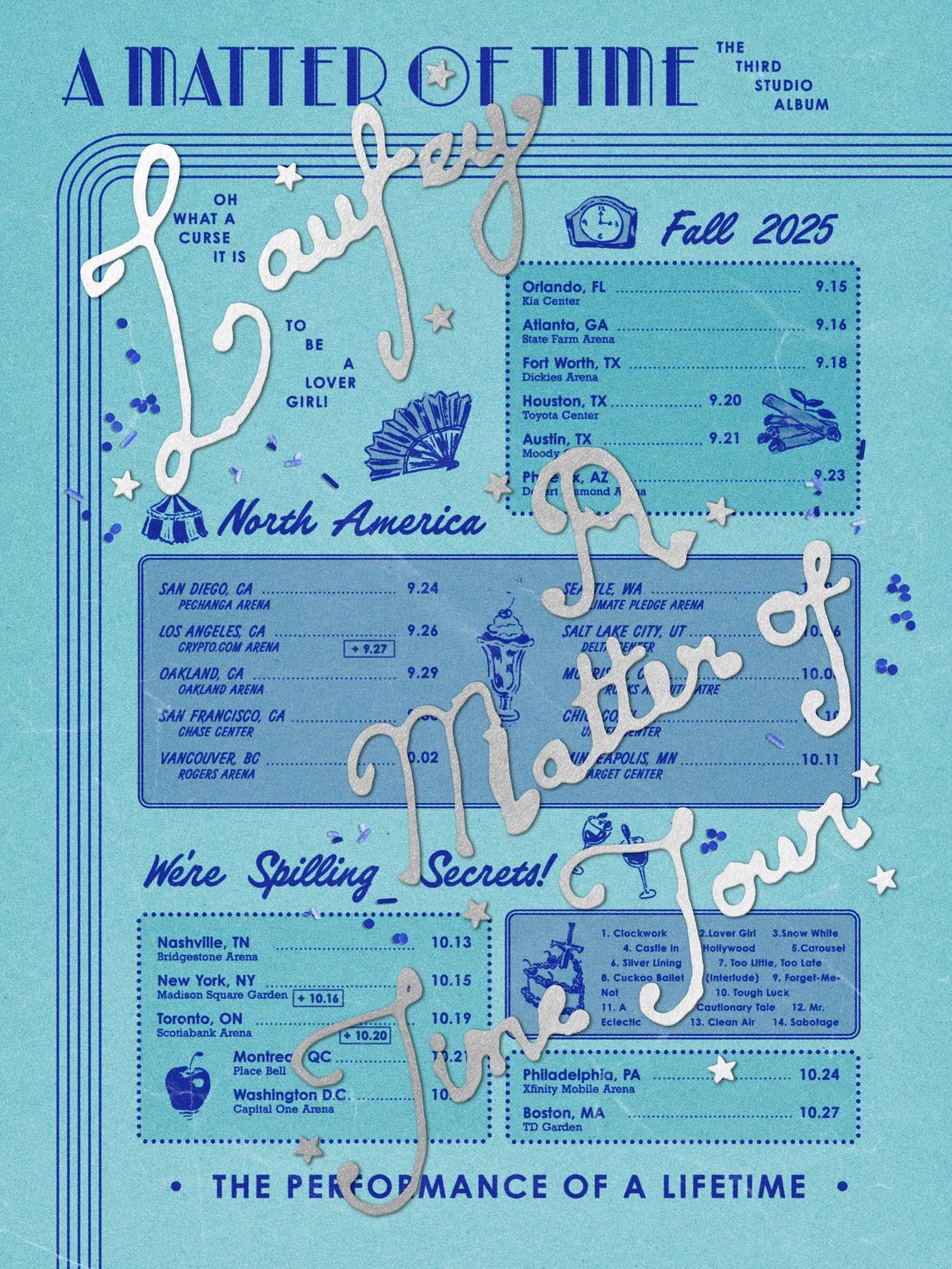
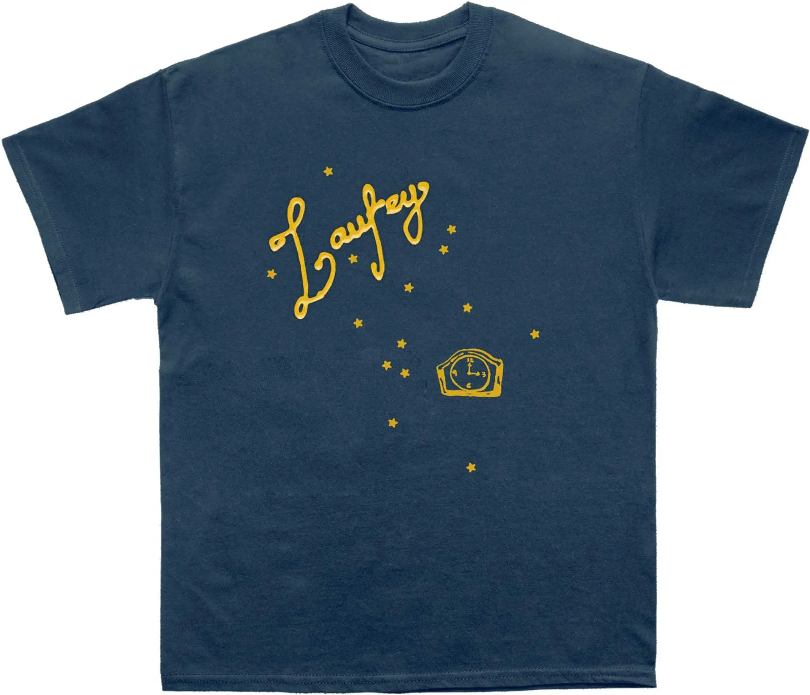
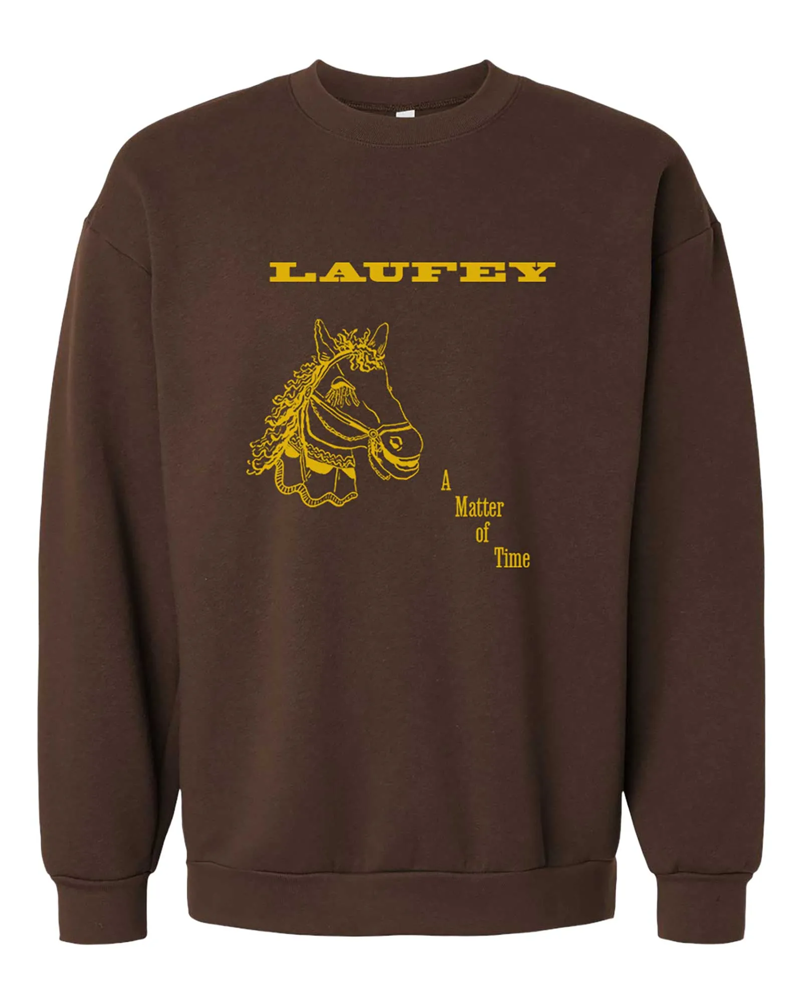
When designing for Laufey, what inspirations or visual references did you draw from to create that vintage old-Hollywood graphic design aesthetic?
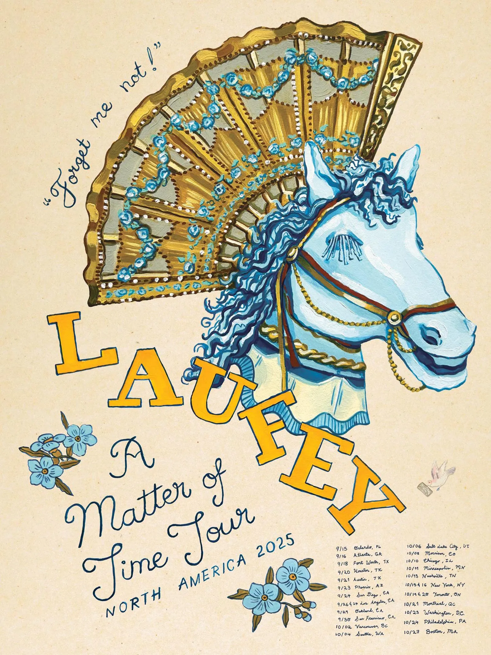
I don’t know that I’d call it old-Hollywood exactly. I was thinking a lot about carousels, circuses, the ballet, 50s malt shops, blue and silver, and just the feeling of it all: something sweet, lush and beautiful, but also kind of twisted at times. Junia and Laufey had already built such a poetic visual world around the album, and it was just about designing merch that aligned with and extended that vision.
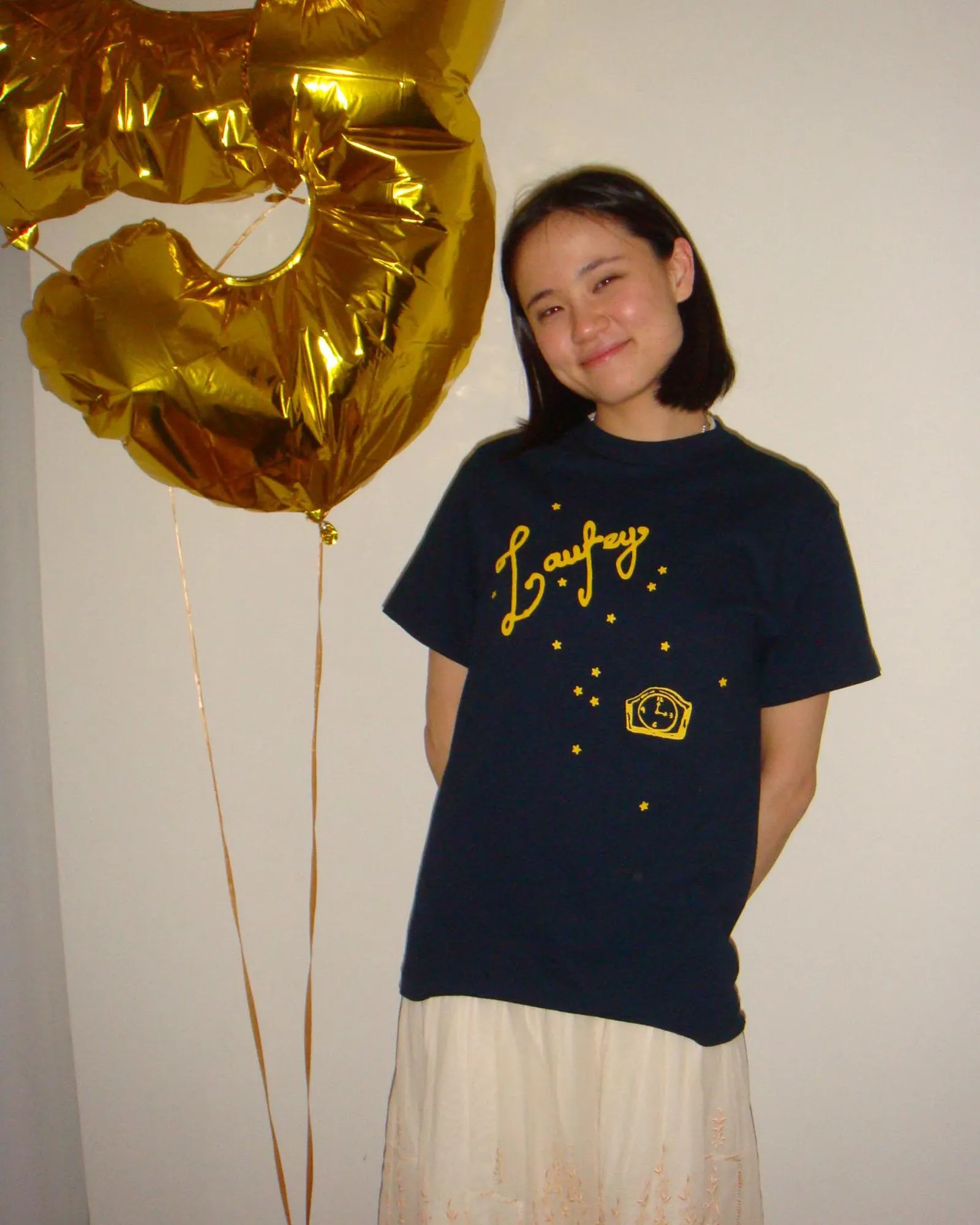
Some of my favorite objects from the merchandise I designed include the main tour tee and tour poster, which used silver lettering I originally created using real cake icing. I was thinking a lot about the Silver Lining music video — I wanted to design something that felt like it could exist in that universe. The song felt really timeless and analog in a way, but also really experimental, and I wanted my design process to reflect that.
What do you admire about Laufey as an artist, and what does it feel like when you see someone in public wearing one of your designs?
I’m such a fan. I think Laufey is totally singular as an artist; she just does her own thing and she never stops experimenting. Especially as someone who loves all things vintage, I really admire the way she draws from the past — her music has such a deep respect for history and for craft, but always feels fresh and entirely her own.
Seeing my work in the wild is the best feeling; it really never gets old. It’s so corny but I really do just love making work that makes people happy; it’s so special to be part of people’s lives in that way. I don’t know if I’ll ever get used to it.
Frequently Asked Questions
Gabrielle Uy is a Filipino designer, illustrator, and creative strategist based in New York. Born and raised in Manila, she is the daughter of Jerry and Sabrina Uy, founders of the Filipino childrenswear brand Gingersnaps.
Uy studied at The British School Manila in the Philippines and graduated summa cum laude and Phi Beta Kappa from Yale University’s arts program.
Uy began collaborating with Laufey after receiving an unexpected email from the singer’s team while she was still in college. She later went on to design merchandise and visual materials that helped shape Laufey’s nostalgic and romantic visual identity.
Uy was part of the design team at Special Offer that built the visual world around Brat, working alongside designer Brent David Freaney as the album exploded into one of 2024’s defining cultural moments.
Uy drew from carousels, circuses, the ballet, 50s malt shops, and a blue-and-silver palette, aiming for something sweet and lush but slightly twisted. The main tour tee and poster feature silver lettering she created using real cake icing.