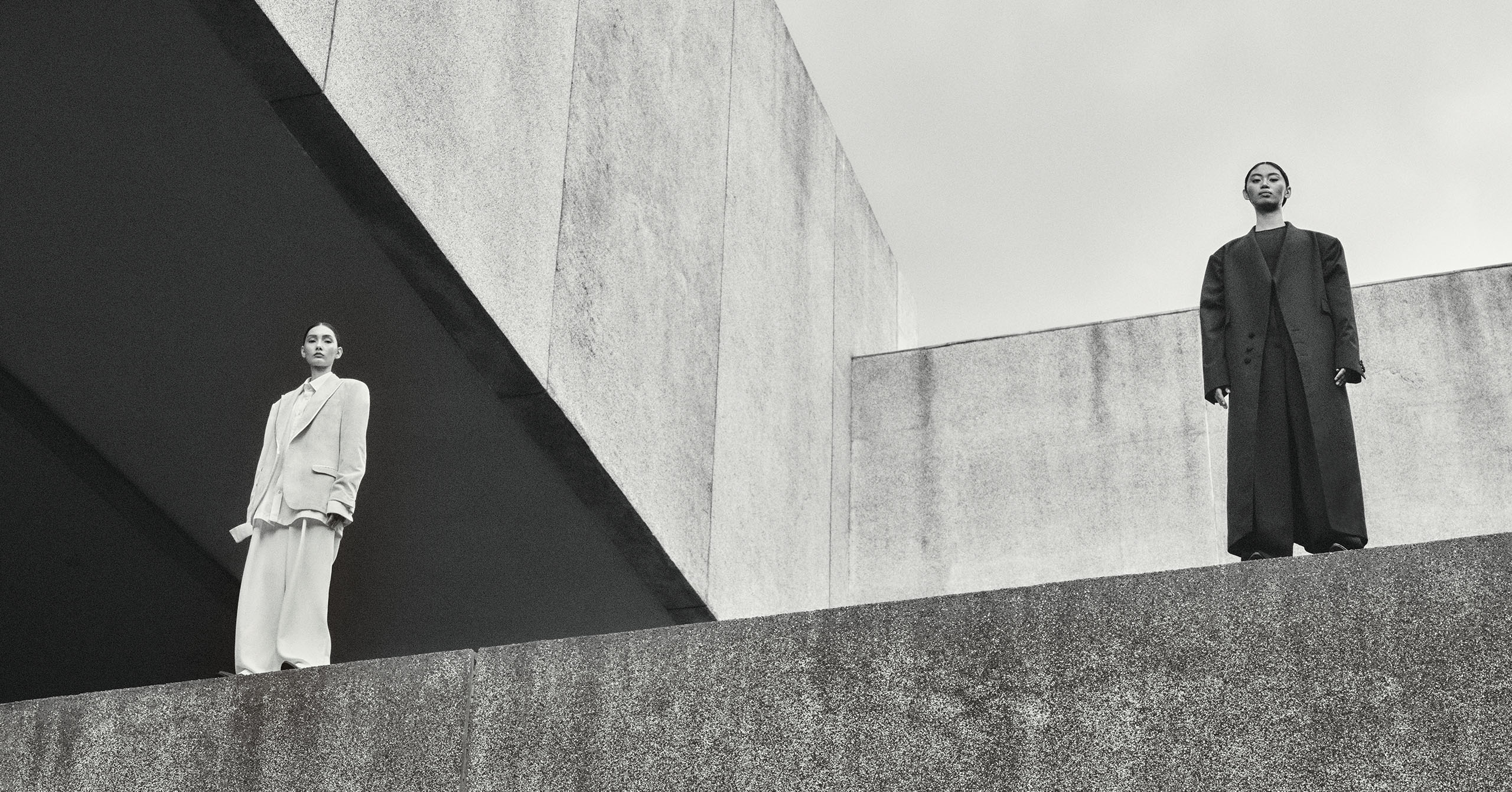
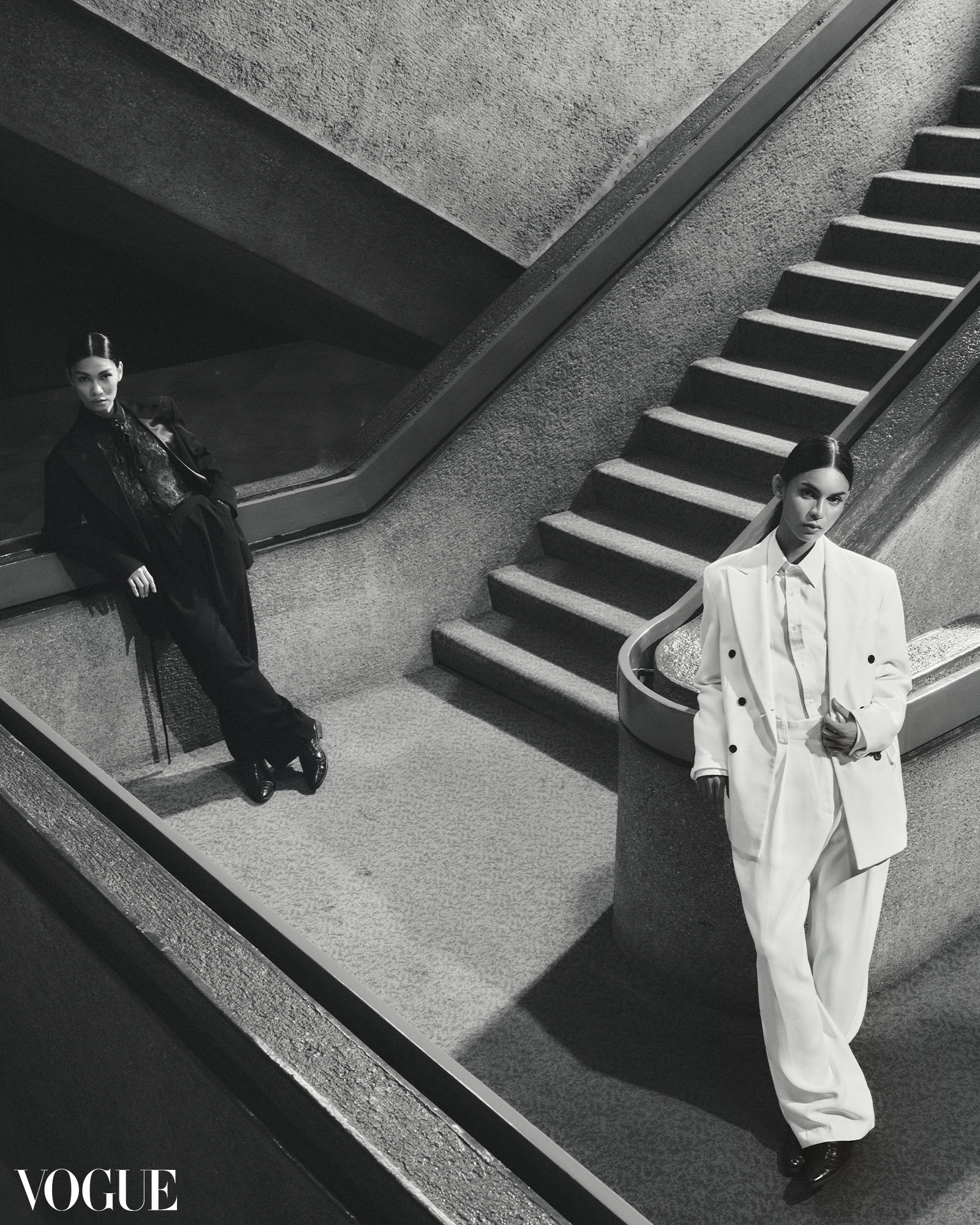
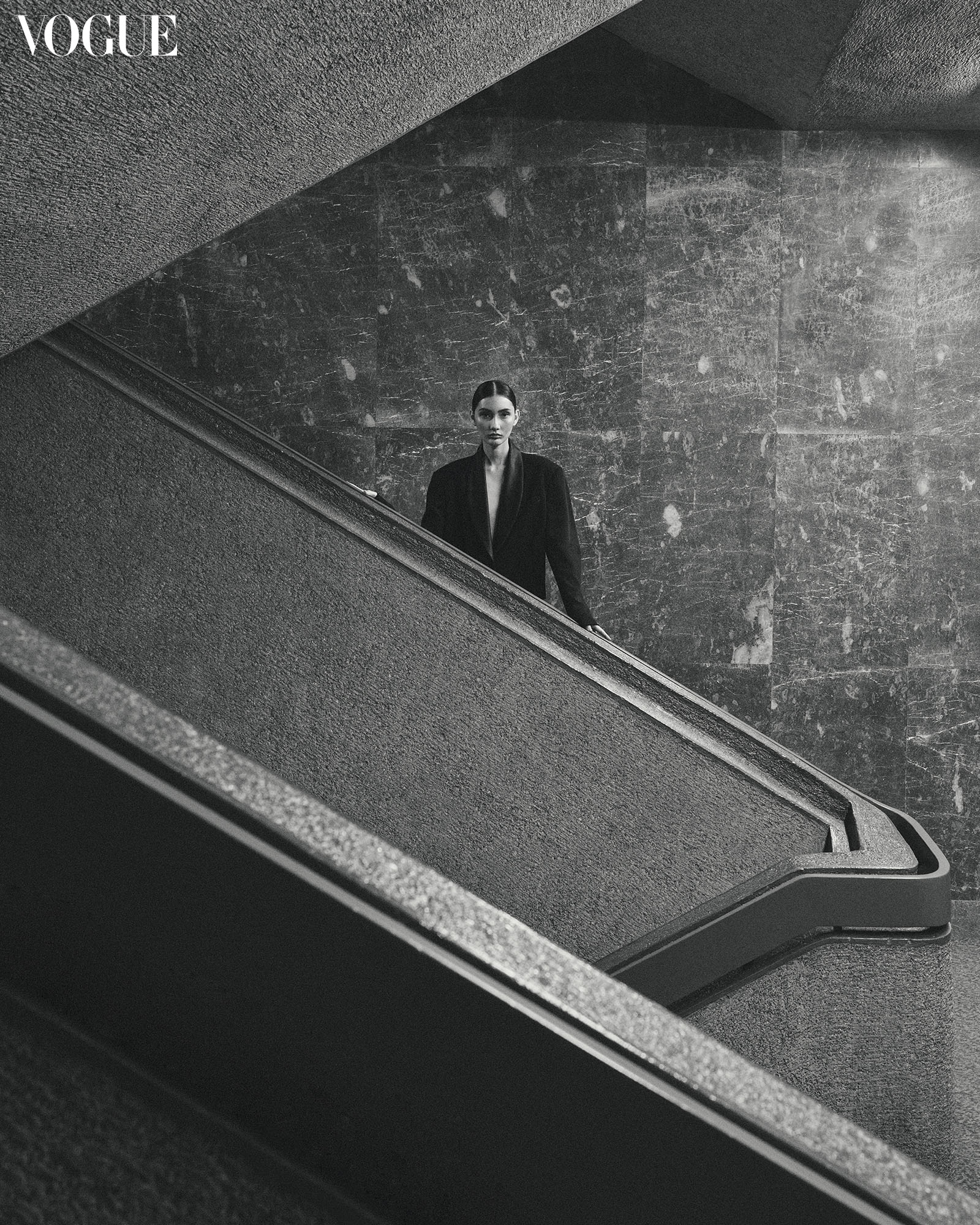
Diana wears a JAGGY GLARINO blazer and button-down shirt, D.D.DAILY trousers, AVEL BACUDIO boots. Queenie wears a .ARCHIVES coat, D.D.DAILY bodysuit and trousers, AVEL BACUDIO boots. Photo by Sharif Hamza
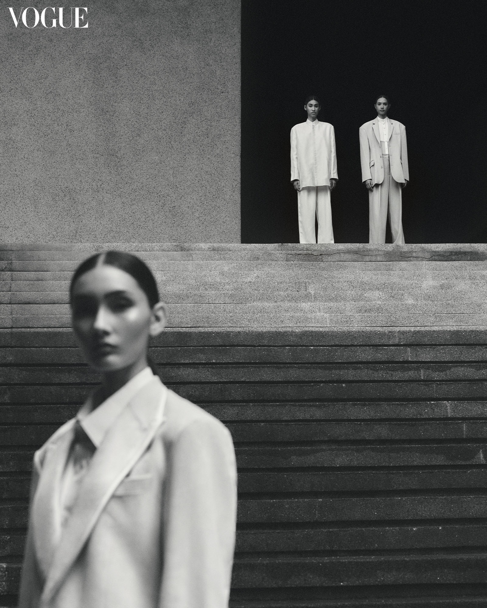
Queenie wears a D.D.DAILY blazer and trousers. Taki wears a RAJO LAUREL suit set, button-down shirt. Jana wears a D.D.DAILY blazer and skirt, AVEL BACUDIO boots. Sidney wears .ARCHIVES coat, D.D.DAILY bodysuit. Photo by Sharif Hamza
Modern menswear-inspired silhouettes complement the Philippine International Convention Center. Patrick Kasingsing breaks down National Artist Leandro Locsin’s seminal work.
A decade ago, I stumbled upon Brutalism during a visit to the university library. As a graphic designer-in-training-slash-frustrated-architect, I felt an immediate attraction to this style, eagerly seeking an approach that would inform my creative work. The resourcefulness that gave birth to brutalism, its acknowledgment of less-than-ideal realities, and its function-forward approach deeply resonated with me as a young designer in search of a guiding ethos.
Brutalism emerged as a post-war movement, thriving amid a world eager to rebuild swiftly and efficiently, with limited resources but abundant ideas. The “brutal” in brutalism refers to the raw finishes and material honesty that are emblematic of the style. This architectural style was a reaction to pre-war modernism’s opulence, inaccessibility, and propagation of social divisions. Built quickly and economically, Brutalism embraced simplicity and utilized readily available materials in response to post-war scarcity. It proudly embraced honesty, celebrating materials in their raw state and flaunting utilitarian, and functional elements instead of con-cealing them. Brutalism, more concerned with ethics than aesthetics, takes various forms beyond just “raw concrete.”
Additionally, it sought to experiment with novel ways of living, promoting social interaction and community through concepts like “city within a city,” “urban living rooms,” and “streets in the sky.”
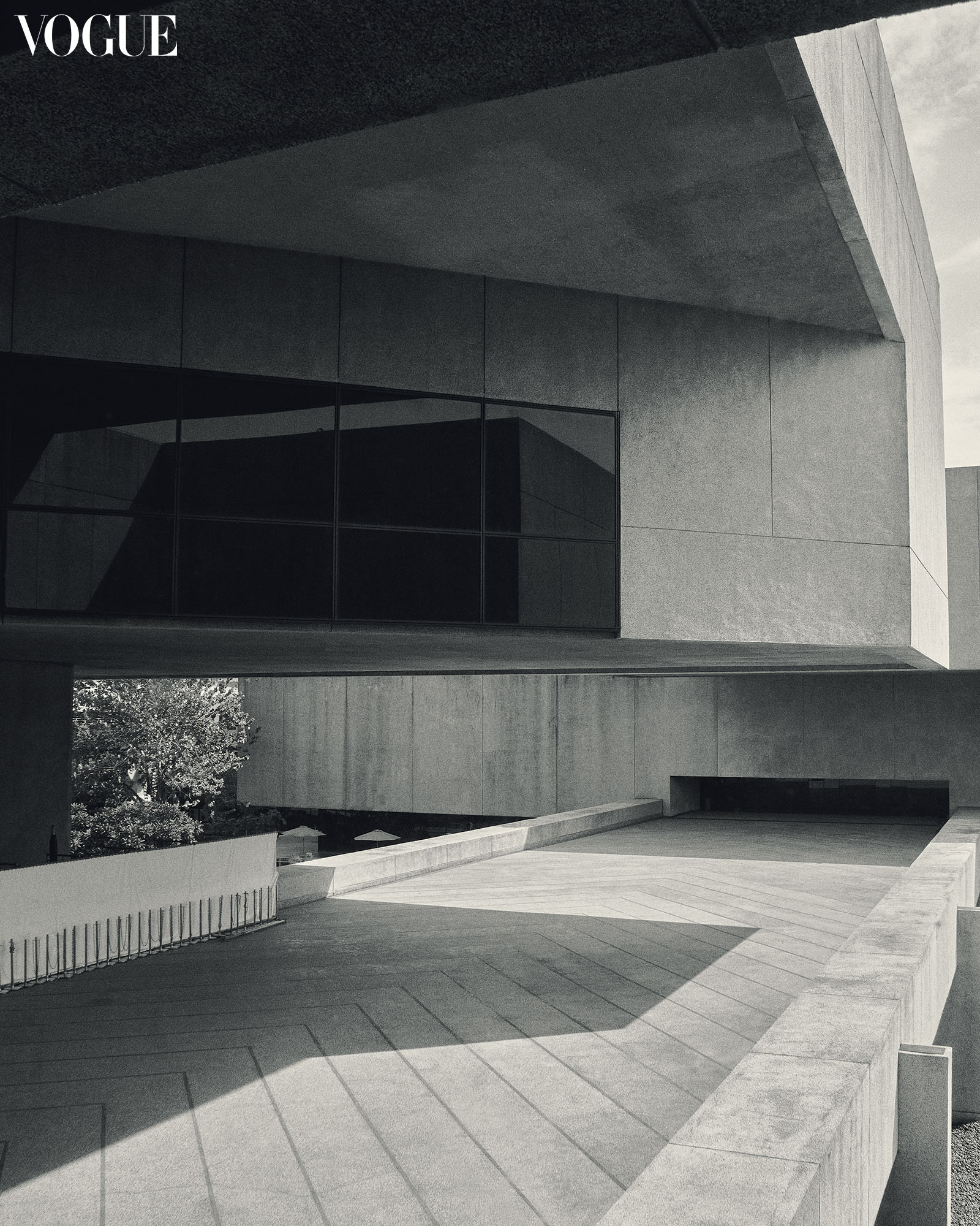
Despite its people-centric principles, Brutalism has always been one of the most polarizing architectural styles, often criticized for its seemingly rough appearance, imposing atmosphere, and association with controlling regimes. By the late 1980s, the movement gradually declined, giving way to postmodernism—an architectural reaction that stood as the antithesis to Brutalism. Postmodernism, in contrast, embraced playfulness, quirkiness, and decoration, diverging from the serious and unadorned nature of Brutalism.
In its finest examples, Brutalism defies expectations by revealing another contradiction: beauty
Beauty in opposites
Brutalism, with its noble-sounding goals, appears to be laden with contradictions. While it champions every man with its honesty, economy, and community-centric aims, it also repels with its workman-like appearance, raw finishes, and associations with failed social experiments by architects and the government. However, in its finest examples, Brutalism defies expectations by revealing another contra-diction: beauty. Despite its indifference to conventional notions of beauty, this architectural style has given rise to some of the most awe-inspiring and poetic spaces in architecture. The Barbican Centre, Habitat ’67, the old Whitney Museum—these spaces flawlessly convey the movement’s ethic of honesty with remarkable finesse and splendor. This is where the Philippine International Convention Center (PICC) comes into the picture.
Back in college, I stumbled upon the PICC while exploring the library’s Filipiniana section and discovering Nicholas Polites’ rare monograph on the National Artist for architecture, Leandro Locsin. I was spellbound by the entire volume and would borrow it more than a few times; my eyes would always linger however on the pages that show the PICC, masterfully captured by Japanese photographer Akio Kawasumi, fresh from when it was rushed to completion in 1976 in time for the Philippines’ hosting of the IMF-World Bank meeting. The seemingly weightless concrete overhangs, the hypnotic lobby chandeliers, and the monumental Arturo Luz sculptures. I knew a visit was a must.
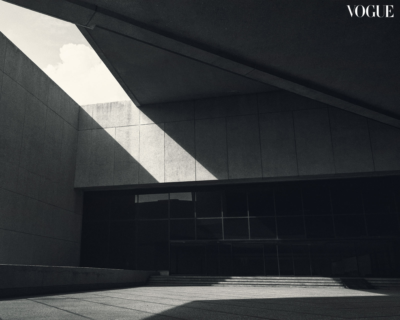
It only took seven years. But in 2018, upon the invitation of the PICC, I was able to book a visit to the complex via Brutalist Pilipinas, a built heritage database advocacy that I had begun a year back. My first visit, as cliché as it may sound, was revelatory. Yet, what continues to astound me with each visit are the contrasting qualities eloquently embedded in its forms and spaces, a Locsin trademark. These unique characteristics not only establish the PICC as a quintessential brutalist structure but also make it a memorable space that demands to be experienced by architecture enthusiasts and the general public alike.
The PICC commands attention with its imposing presence, purposefully designed to accommodate events big and small. Spanning 12 hectares and composed of four building volumes, the complex cleverly employs architectural techniques to conceal its sheer size and maintain a sense of balance.
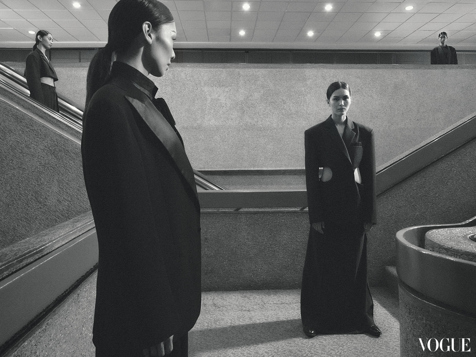
Interestingly, as one ventures into the entrance spaces, a striking shift in ceiling height becomes apparent. This deliberate design choice is evident in the entrance canopy and the lower bridgeway connecting the Delegation Building to the iconic Plenary Hall. It highlights the architect’s keen awareness of the human scale and the ability to create moments of awe while respecting the individual’s experience.
Locsin knows precisely when to captivate and when to provide a backdrop for activity. From the dramatic entry lobby to the grand staircase serving the center’s two halls, the building confidently takes center stage. Yet, it also understands when to step back and let the events unfolding within its walls become the focal point. This balance between spectacle and subtlety ensures that the PICC remains a space that not only impresses, but also accommodates the diverse experiences and needs of its users.
Heavy yet light
Locsin is a master of the cantilever (those gravity-defying bits of a building that extend out in the air) and he has one-upped his masterful work at the National Theater with several feats of architectural acrobatics at the PICC. From the seemingly unsupported entrance canopy to the handlebar volumes of the Delegation and Secretariat Building, the weightless concrete staircases that slither down the lobby to the dramatic overhang of the Plenary Hall that beckons to marching graduates, Locsin has bestowed concrete, a heavy-looking material, with surprising grace and lightness in the PICC.
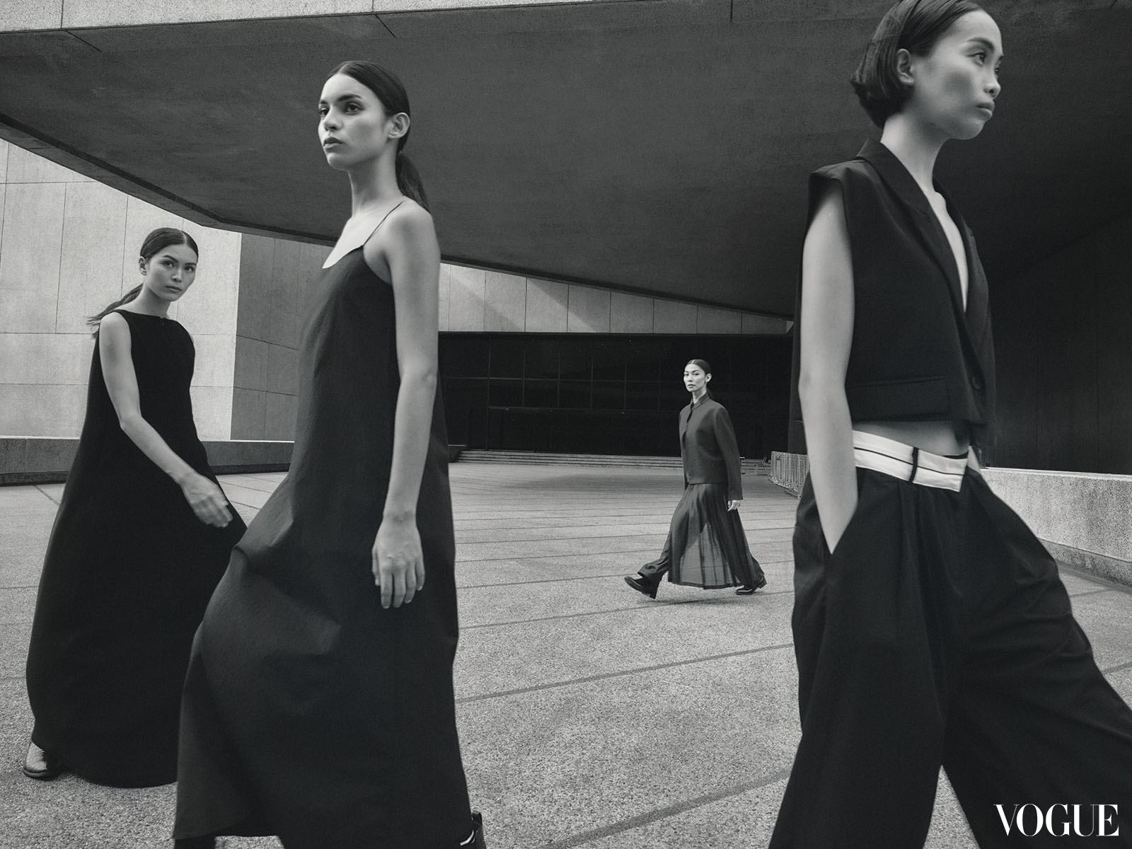
Workmanlike, often associated with construction, and frequently shielded from view with a layer of paint, concrete is celebrated in all its rawness at the PICC. It is an omnipresent material in the complex, but it manifests in various executions, which gives the material nuance and a capacity to exude qualities that you don’t usually associate with it, like warmth, color, and finesse. The concrete pillars of the grand lobby are done up in corduroy concrete, which emanates strength but also masks its heft. The curvaceous staircases of the convention center possess sculptural qualities with their smoothened concrete skin. The seashell-aggregate finish of the exteriors is a willing canvas for Manila’s world-famous sunset to paint its fiery light on. Locsin has always had an intimate relationship with concrete which he deems a material perfect for our tropical context. His mastery of the material is on full display at the PICC.
The PICC is renowned not only for hosting international events and government functions but also as a graduation venue and a place for the swearing-in of board exam passers. It has become an architectural landmark symbolizing achievement and new beginnings.
I found the PICC equally captivating as a solitary experience. During the height of the pandemic in 2021, I had the opportunity to document the complex without the usual crowd and noise associated with a convention center. This unique experience was both challenging and enlightening, allowing me to view the PICC as an architectural object. I appreciated its textures, observed how light and shadow played upon its surfaces, and became more attuned to the spatial contradictions that make the PICC an incredibly rewarding space to explore.
While other architects might overlook small details in large projects, these nuances can make all the difference between memorable spatial experiences and fleeting ones. The PICC, in my view, goes beyond being a mere functional container. Instead, it becomes a showcase of what can be achieved with humble materials, celebrating their inherent qualities, and acknowledging the spatial experience of both individuals and the community, making it a truly remarkable space.
Makeup: Angeline Dela Cruz, Dodie Guico, Gello Bautista, Japeth Purog, Jay Salcedo, Lea Ancheta-De Barras, Leslie Osting, Yuan Ishy, All from Estée Lauder. Hair: Dale Mallari, JA Feliciano, Mong Amado, All from Estée Lauder. Models: Diana Kuznetsova of Elite Manila, Jana Stuntz of Elite NY, Lulu Eslao of Luminary Models, Queenie Salmon of IM Agency, Sidney Flores of Certeza Models, Taki Shimada of Elite Manila, Tracey Dela Cruz of PMAP, Yaofa Dela Cruz of Mercator. Nails: Extraordinail. Art Director: Jann Pascua. Producer: Anz Hizon. Multimedia Artists: Gabbi Constantino, Tinkerbell Poblete. Photographer’s Assistants: Aaron Nebreja, Artu Nepomuceno, Choi Narciso, JV Rabano, Tim Hoffman. Stylist’s Assistants: April Lozada, Maria Paz Gamus, Patricia Co, Ticia Almazan. Interns: Charlize Choa, Jean-Jacques Girod-Roux. Shot on location at the Philippine International Convention Center.
