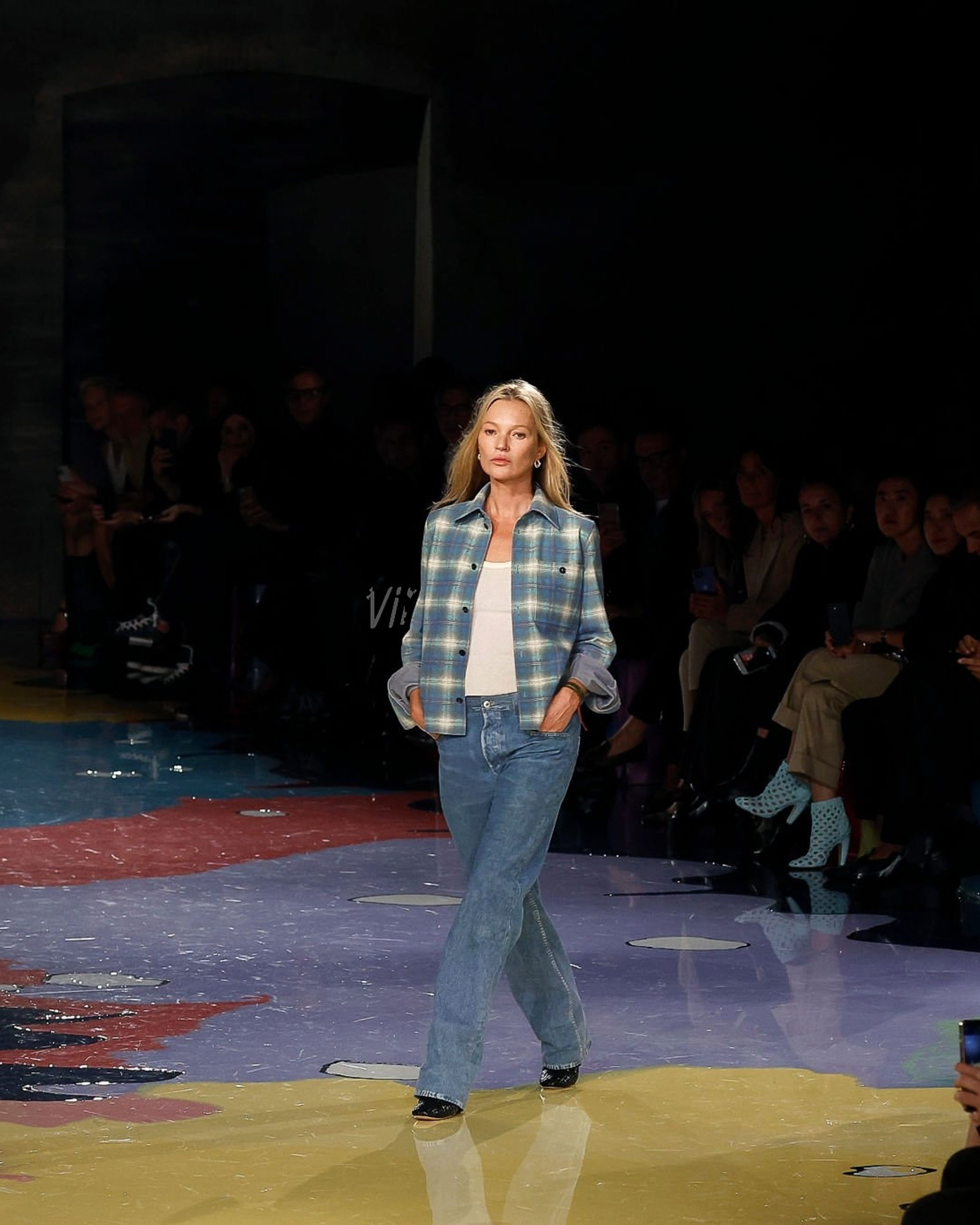
Bottega Veneta, spring 2023 ready-to-wear. Getty Images.
Object lessons from the year in fashion.
There was a shift this year in the world of luxury fashion that seems to have gone unreported: Namely, the eye has become an unreliable narrator in a predominantly “visual” industry. Things are literally not what they seem to be.
Designers have many ways of playing with perception—cut and construction, trompe l’oeil, and surrealist touches (shout-out to Elsa Schiaparelli) among them. Until the postmodern era, these methods were employed to enhance the figure and in pursuit of a set idea of beauty. (Think of how different the body sculpting of Christian Dior’s New Look and Rei Kawakubo’s Lumps and Bumps collection for Comme des Garçons are.) In designers’ embrace of a sort of antifashion ideal of “perverse banality,” this year we see another shift: One that’s not concerned with the body so much as context.
Bottega Veneta’s Matthieu Blazy coined the term “perverse banality” to describe his look-alike leather jeans and workwear, but both Jonathan Anderson and Demna used commonplace, even plebeian, objects as stealth receptors of luxury, in the forms of a pigeon-shaped minaudière at JW Anderson and a Lay’s clutch at Balenciaga, respectively.
Part of this impulse to downplay or sabotage traditional expressions of luxury is likely related to the downward spiraling of the economy. It’s neither considerate of others nor street-smart to flaunt one’s riches in recessionary times. Enter a nouveau pauvre aesthetic. Then there’s the fact that fashion has truly entered a meta-phase. With 22+ years of online shows archived on our site, and the existence of Tumblr, Pinterest, and Instagram, we look at everything through multiple filters and/or in reference to something else.
It’s impossible for me, at least, to look at Blazy’s “flannel shirt”—one of the most thought-provoking designs of 2022—without making a connection to another famous flannel-adjacent top, the sand-washed printed silk one Marc Jacobs showed in his spring 1993 grunge collection for Perry Ellis, which in retrospect might be correctly described as perversely banal too. In 1992 the flannel shirt was already an acknowledged symbol of grunge in the world apart from fashion; in the 30 years between Jacobs’s and Blazy’s collection, the Seattle/thrift-shop aesthetic was canonized. (After all, how many runway rehashes of grunge have we seen?)
We know that around the time that Jacobs designed that silk “flannel” he had been going to see grunge bands play, so the reference was pretty direct; a sort of one-to-one ratio. Industry folks and scenesters alike were riled. Suzy Menkes distributed campaign buttons that read “Grunge is Ghastly,” and after Vogue ran the “Grunge & Glory” portfolio in the December 1992 issue, one of our readers ranted: “I tell you, it makes kids like me want to give up when the music we believe in becomes big business…. It’s not about fashion, it never was. It’s about music, our music and our ‘grungy’ clothing, not just some Calvin Klein design that someone decided to wear wrinkled because they wanted to be wild.”
With the exception of Giles Deacon’s brief stint at Bottega Veneta, it’s never been a go-to brand for the wild child. At one point the company’s tagline was “When your own initials are enough.” Blazy’s leather flannel and denim also leverage the celebrated craftsmanship of the house, but take it in a different, more casual, and surprising direction.
As I tried to parse Blazy’s “flannel,” René Magritte’s masterpiece, The Treachery of Images, kept surfacing in my mind’s eye. The painting, featuring a realistic rendering of a pipe with the legend “C’est ne pas un pipe,” questions our perception of reality. Similarly, Blazy’s design is a flannel shirt which is and is not a flannel shirt all at once. The thing about Blazy’s “flannel”—and Magritte’s painting for that matter—is that it needs words to be understood. What Roland Barthes, the French semiologist, once described as the “image garment” (the visual representation of an object) and the “word garment” (its description) must coexist. You wouldn’t know from looking that the Bottega Veneta shirt wasn’t made of woven cotton, the marvel of the look-alike leatherwork can only be appreciated by description or by touch/interaction with the object itself.
And herein lies another adjustment in fashion: Looking back we can see that narrative has shifted from advertisements (’80s), to storytelling show concepts (the ’90s and ’00s). Now it seems narrative is starting to be embedded or built into luxury objects (garment or accessories) themselves.
It’s uncanny how exhibitions, planned years in advance, seem to land when we most need them. It seems to me that there are parallels to be drawn between Cubism and the Trompe L’oeil Tradition, now on view at the Met, and what is happening in fashion—starting with a change in perspectives. “Cubism’s visual innovations did much more than just reflect a new world. When information got so fast they could hardly keep up, when crises seemed perpetual and war was on the way, the Cubists did something better than representing life; they constituted life through art. They made a whole new culture out of the shards they picked up,” wrote New York Times art critic Jason Farago in his review of the show.
Blazy, Anderson, and Demna are all up to something similar: They place humble objects within a luxury framework. This kind of “trickle-up” thinking sparks joy, rage, and discussion. It also can trick the eye. To really “get” these pieces means realigning substance with surface, to make a connection that is not just virtual.
This article was originally published on Vogue.com
